Firaxis Games
Lead UI Artist
The challenge was to keep all the complexities of previous Civilization games, while opening it up to a new (casual gamer) audience.
This was achieved by reducing the UI’s initial footprint, revealing more information as the game progressed, the players would start the game with minimal options and the UI would grow (in complexity) as the game continued. The UI also provided subtle and continuous guidance on all four victory paths throughout the game.
As for the look and feel of the UI, past iterations had explored ancient, medieval, and space themes. I wanted to find a look that had a progressive (positive) future feel while at the same time feeling historic. Art Deco was perfect fit for this. The menus trim was inspired from buildings and statues of that period, while the icons where influence from the propaganda and travel posters of the that period.
Overall, it was joy to be part of this project and an honor to have worked with such a talented team on what turned out to be a very successful title in the Civilization series.
Game developed using an in-house engine created specifically for Civilizations V.
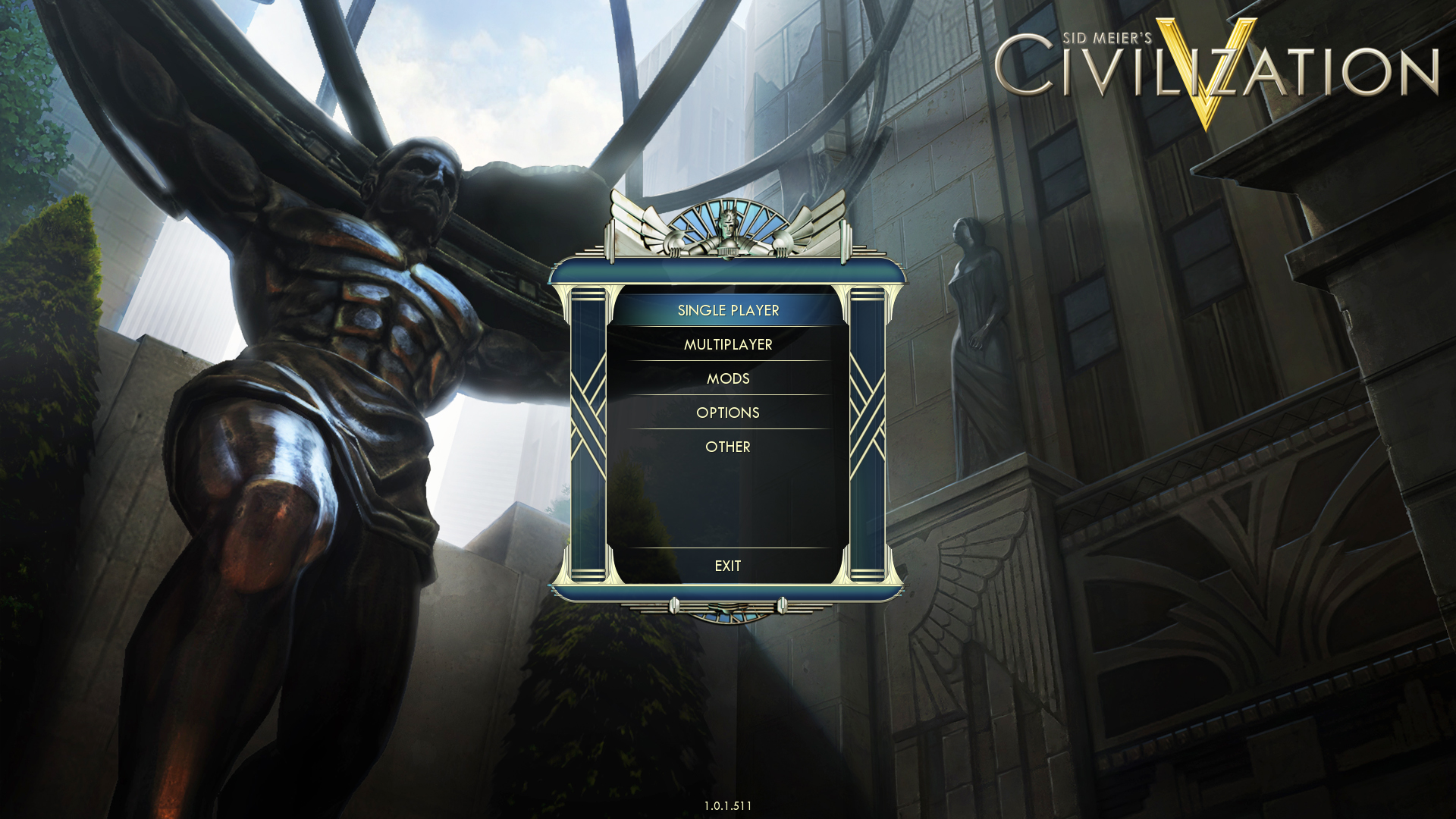
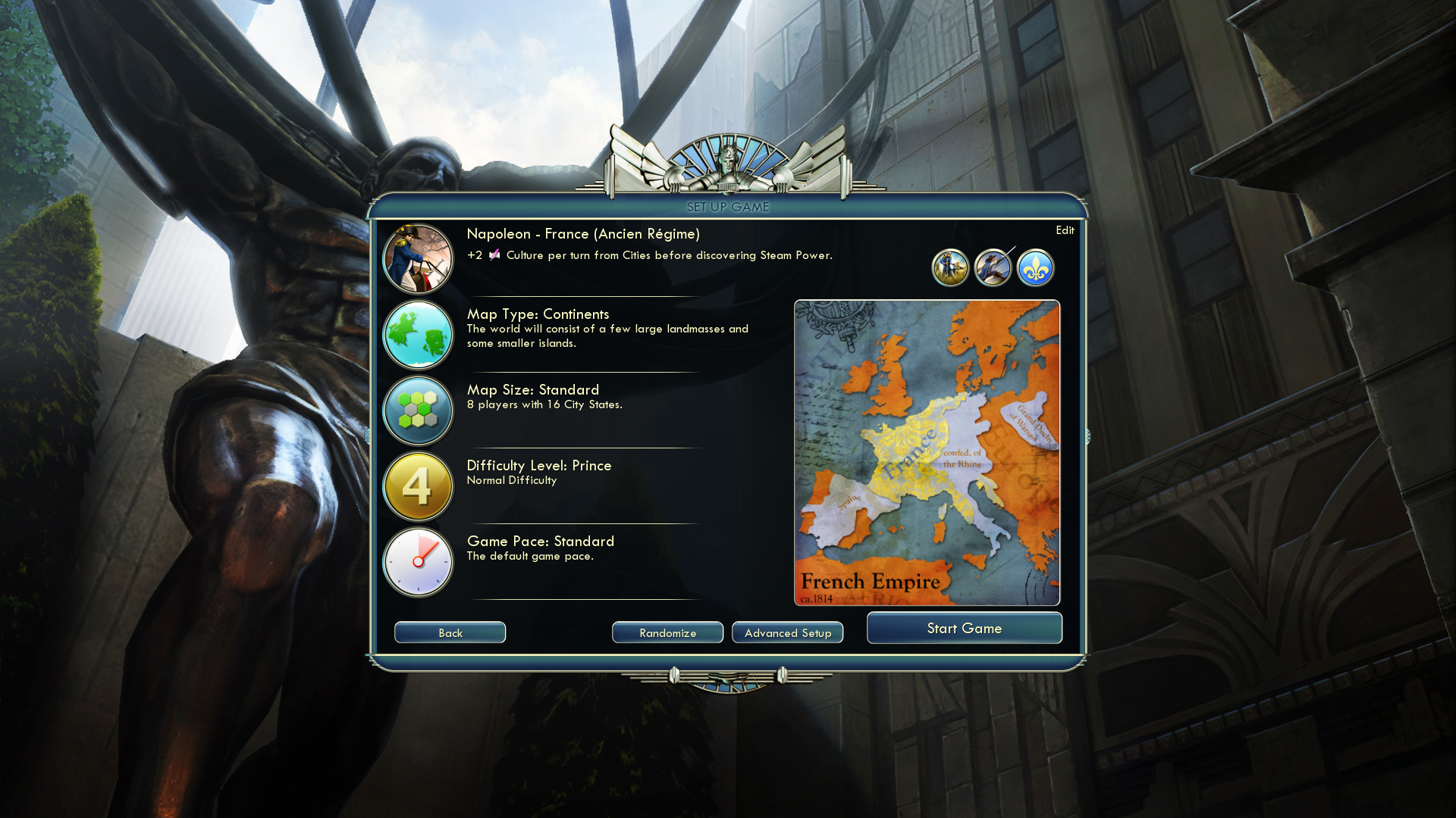
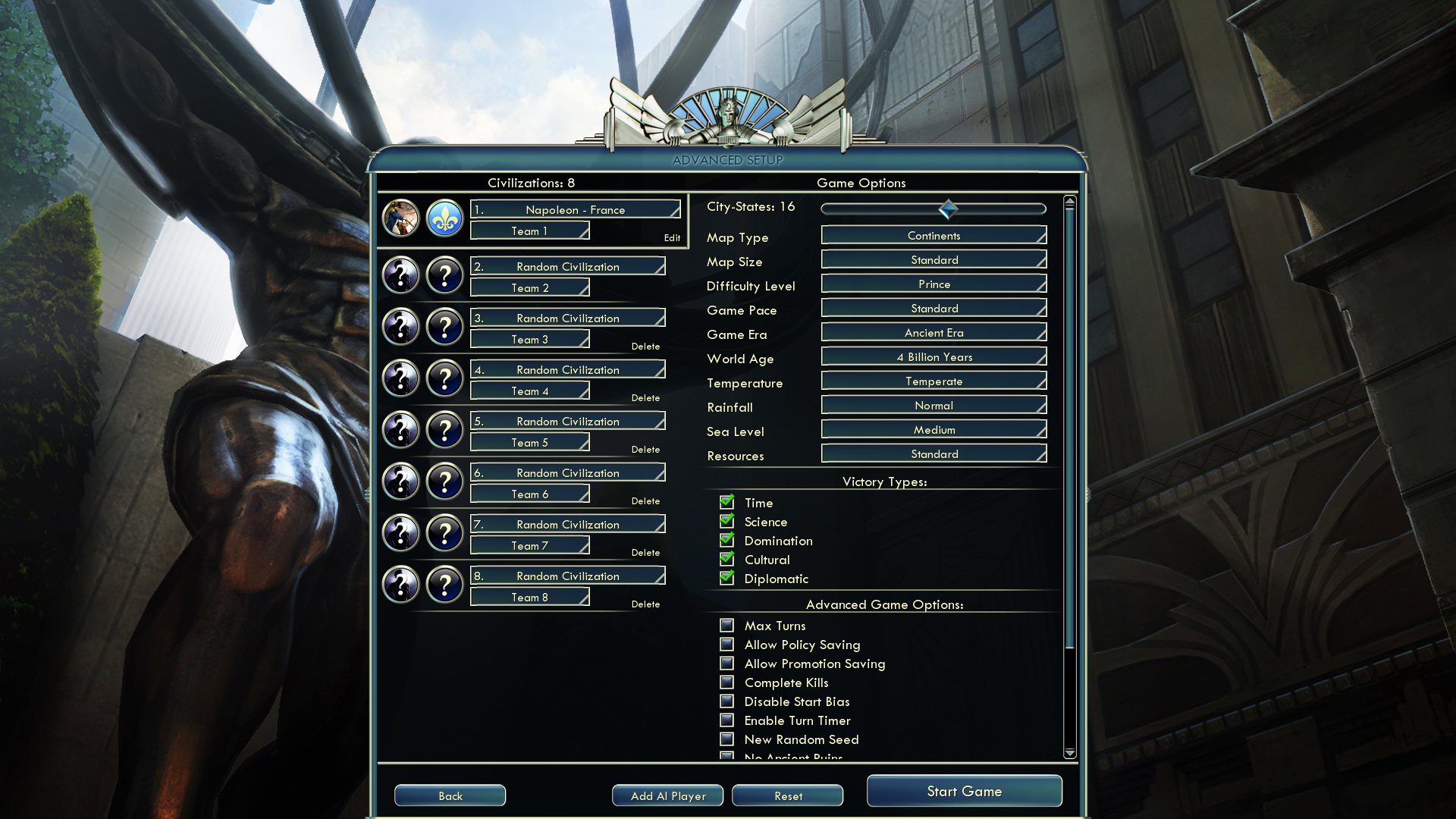
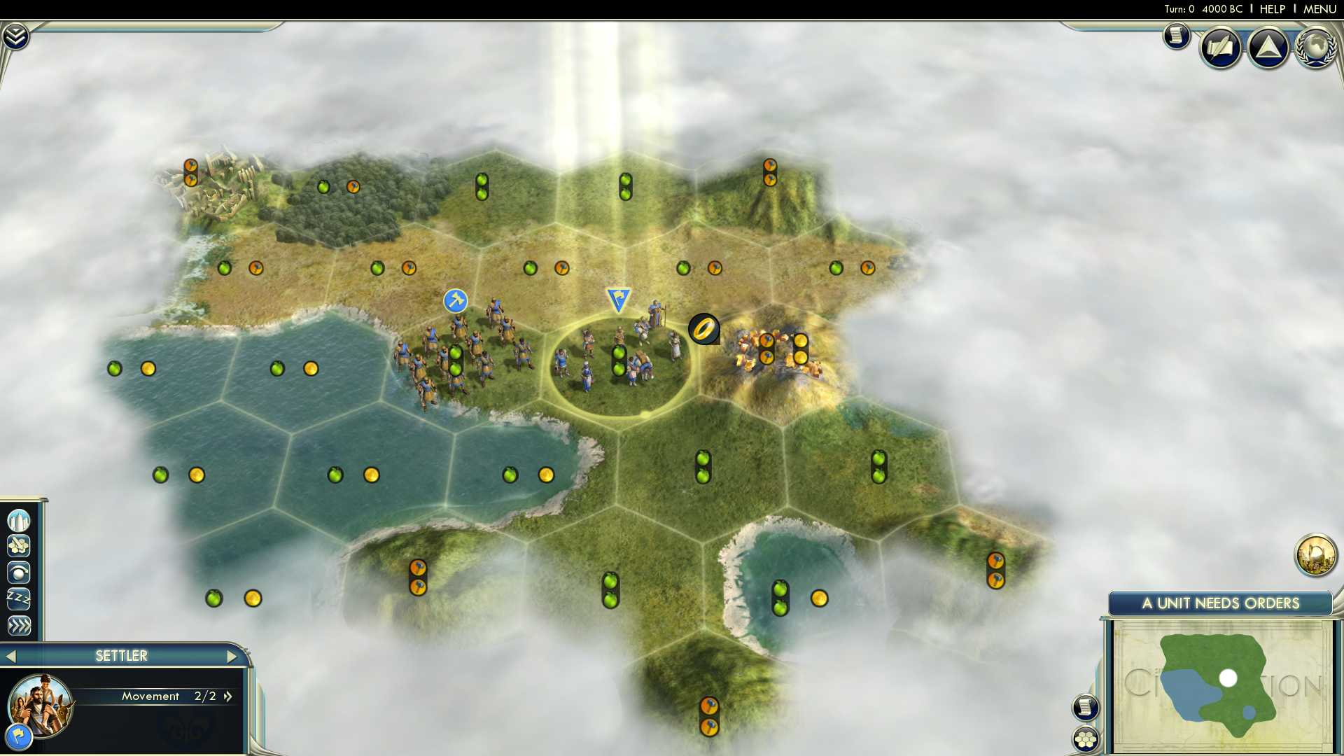
Examples of the Main Menu and Setup Screens.
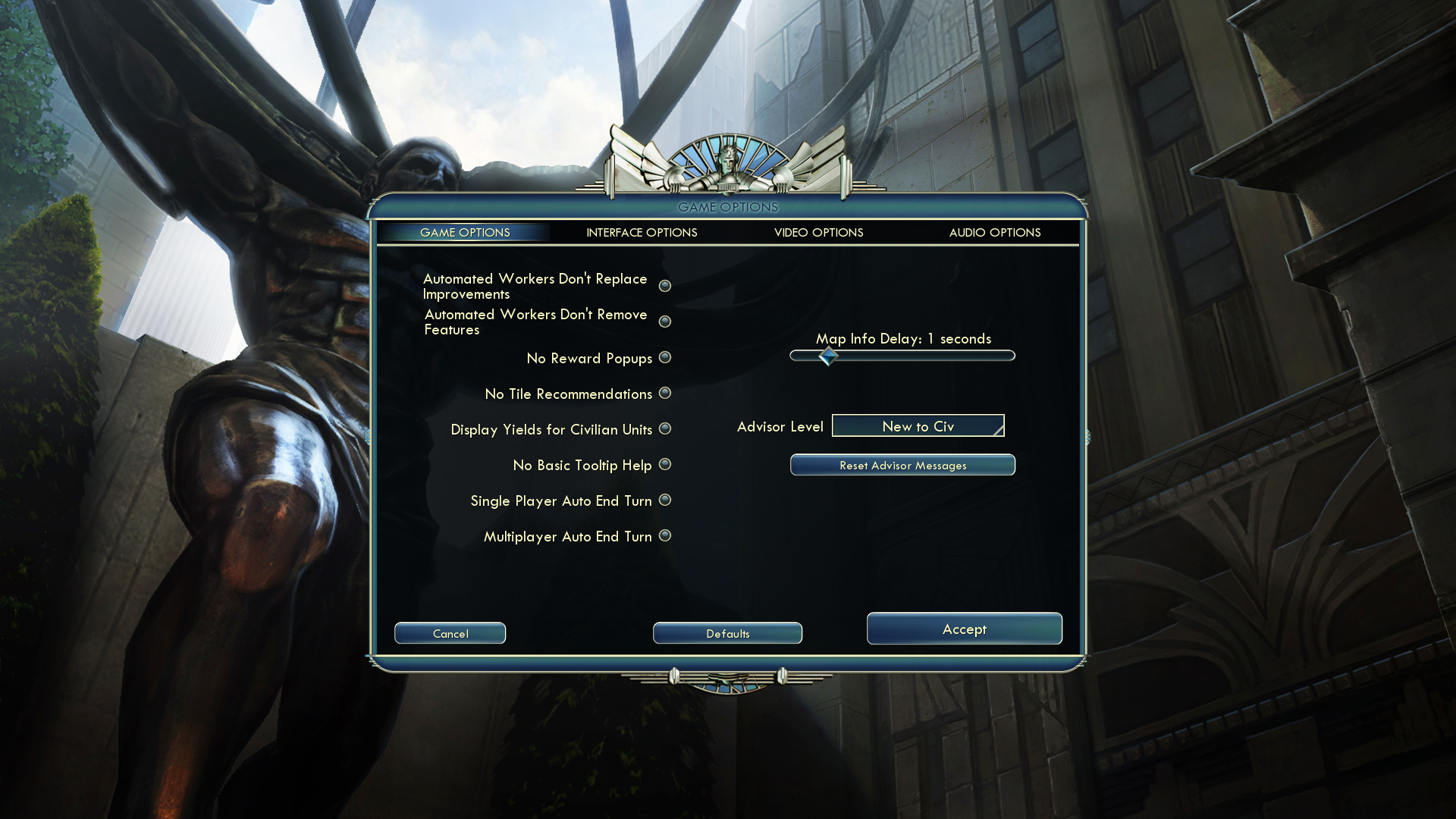
Examples of the Options Screens.


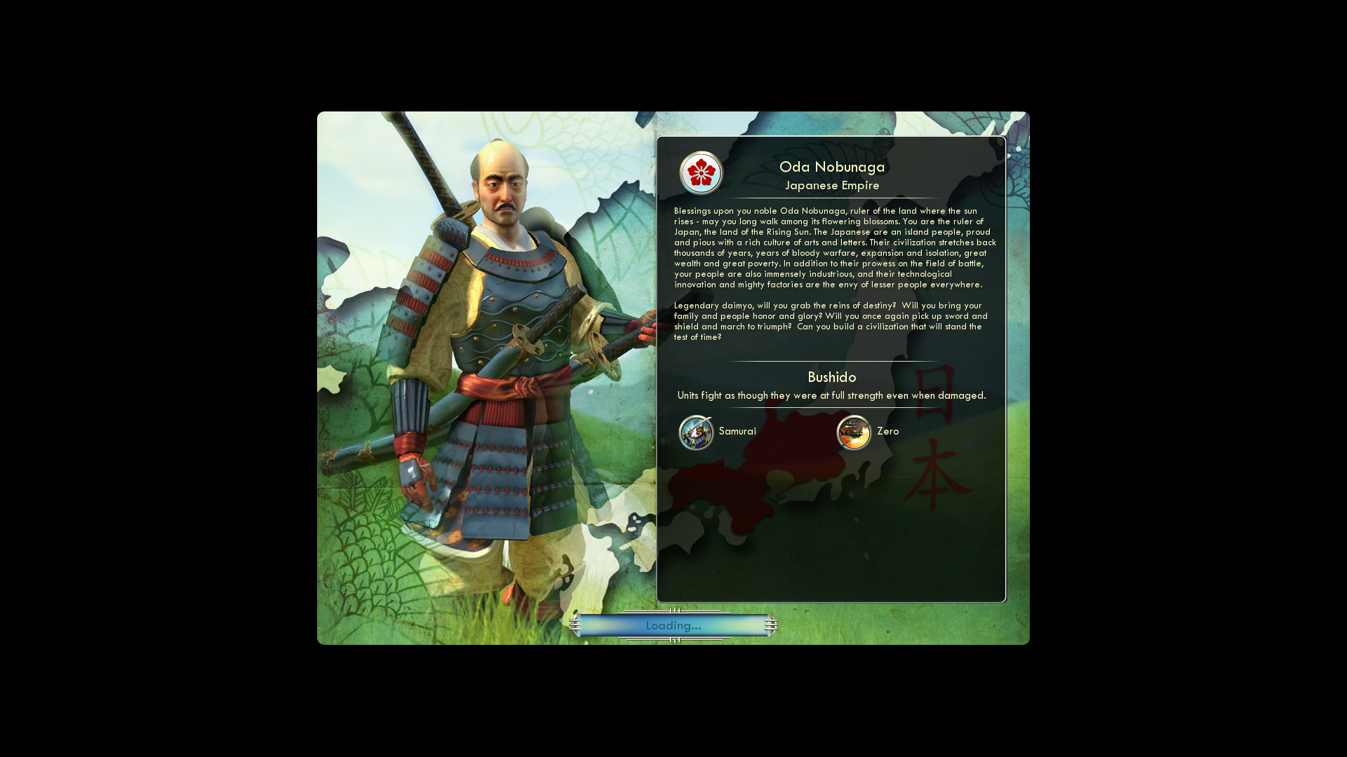
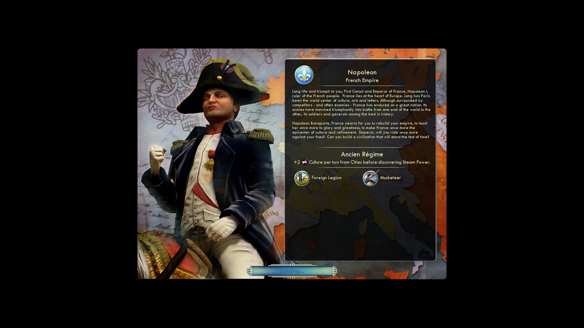
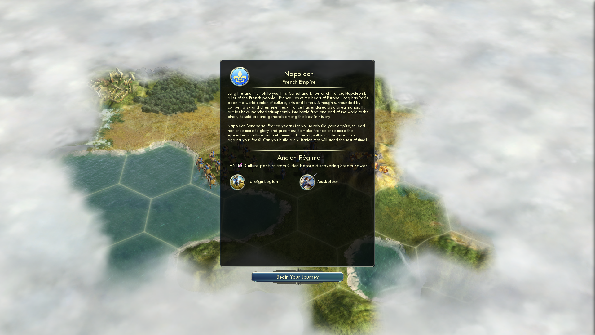
Examples of the Loading screen. Each loading screen would give a narrated overview of the leader and civilization selected. The leader portrait disappears, and a (Begin Your Journey) button appears when the level loading has completed, allowing the player to decide when they are ready to finish the narration and start playing.
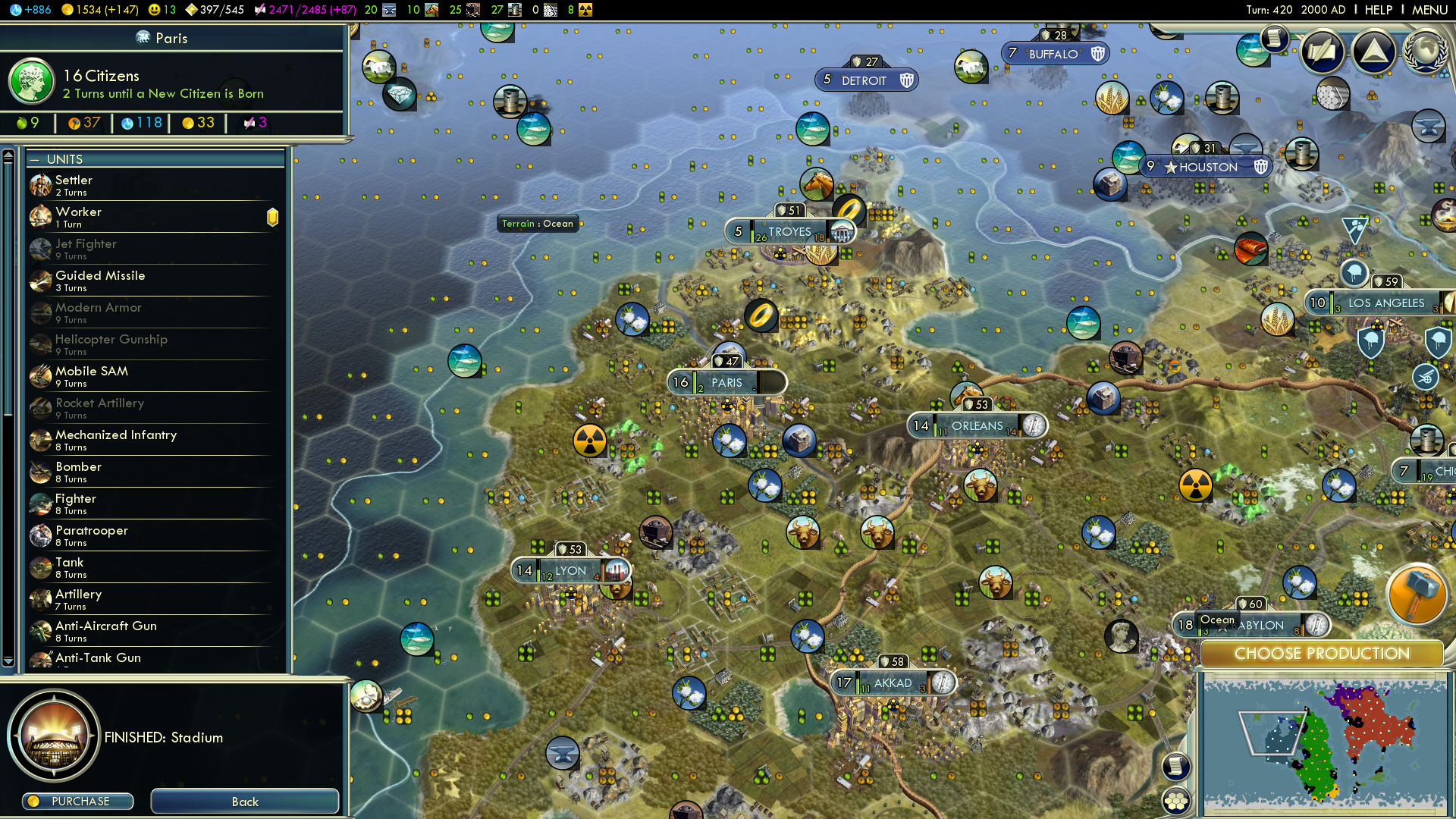
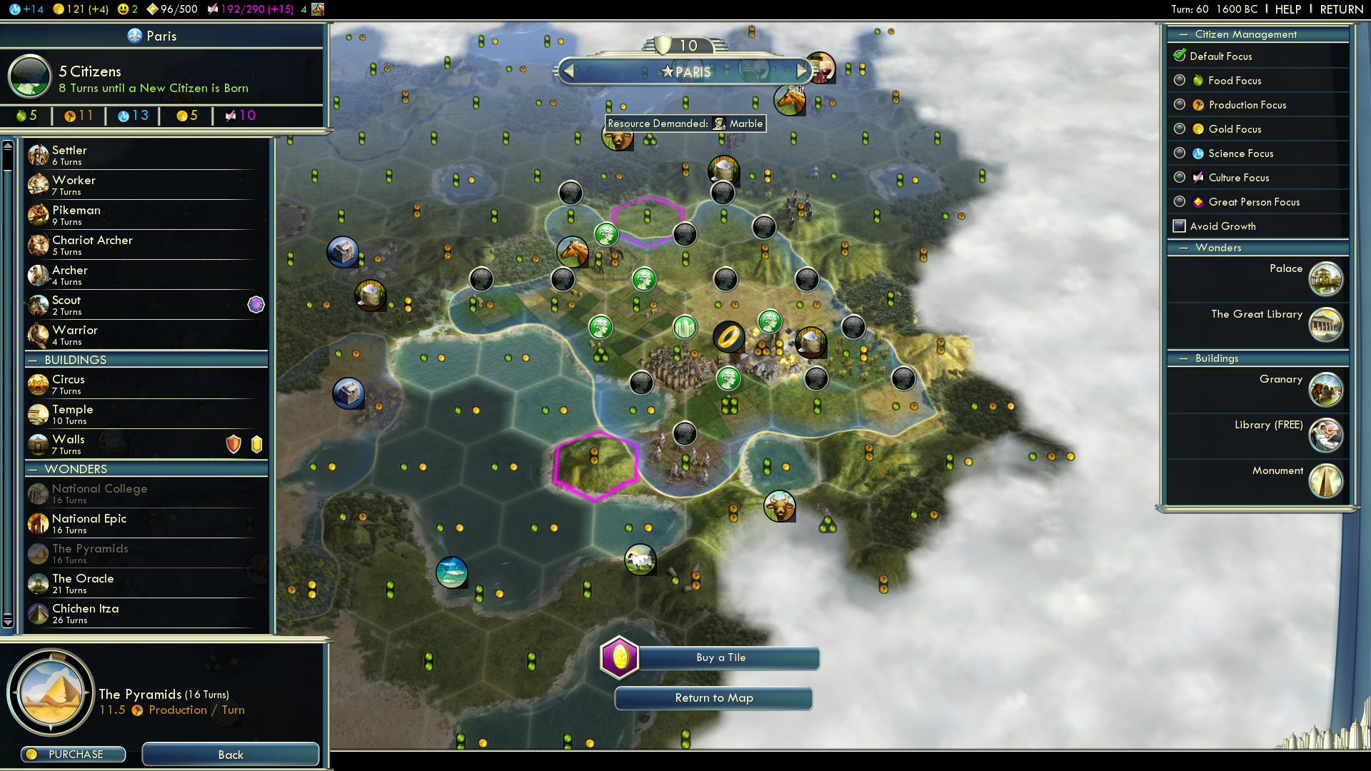
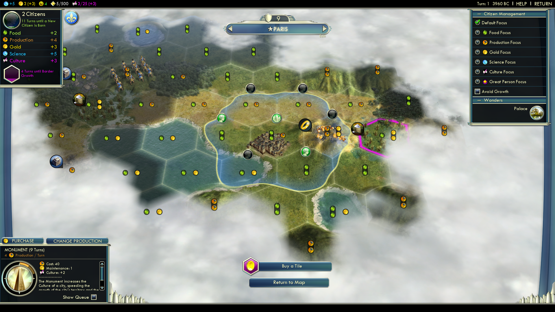
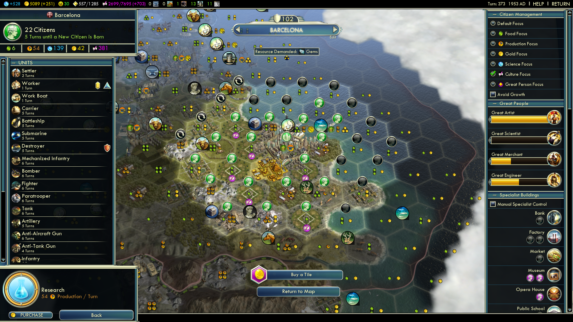
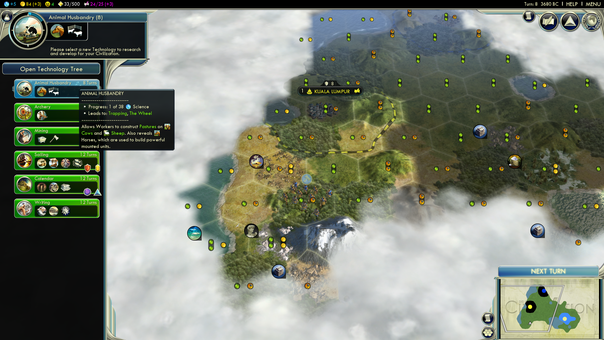
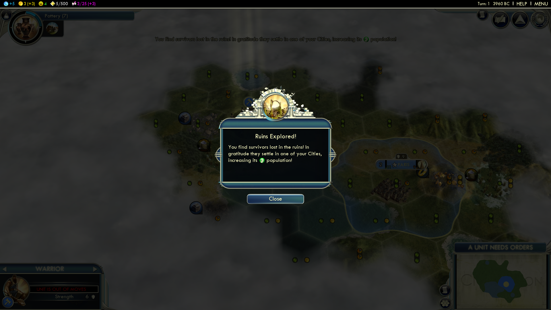
These are only a few examples of the many in-game screens. The goal was to push as much information to the corners and sides to maximize the center playing area. The in-game UI had two sets of art, large (to show off the icons, trim and easy to read text) and minimized (reduced the icons, trim and text).

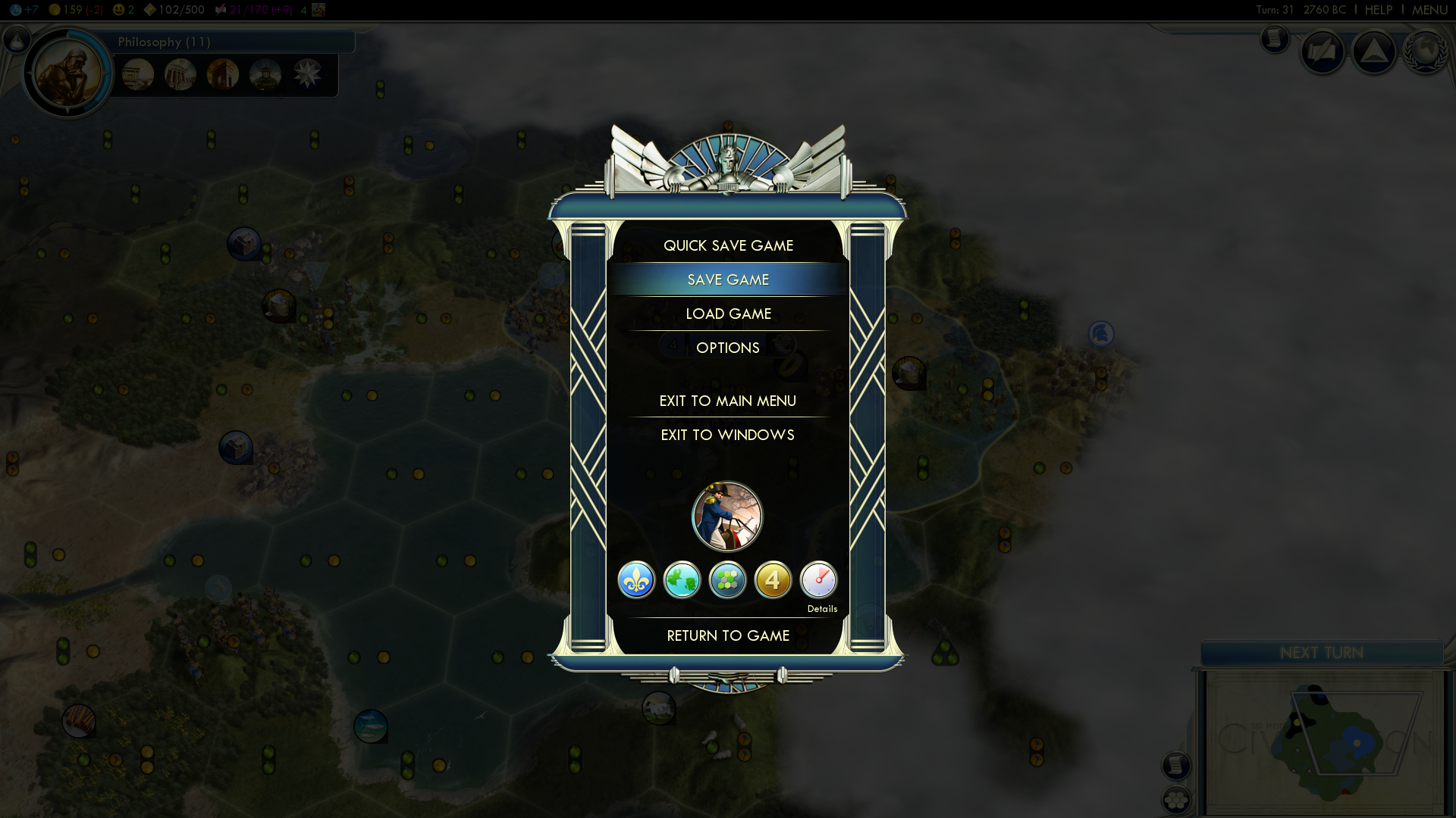
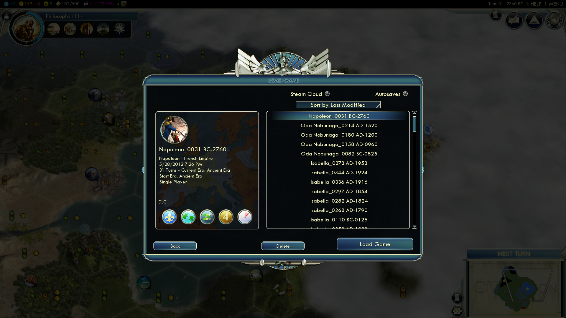
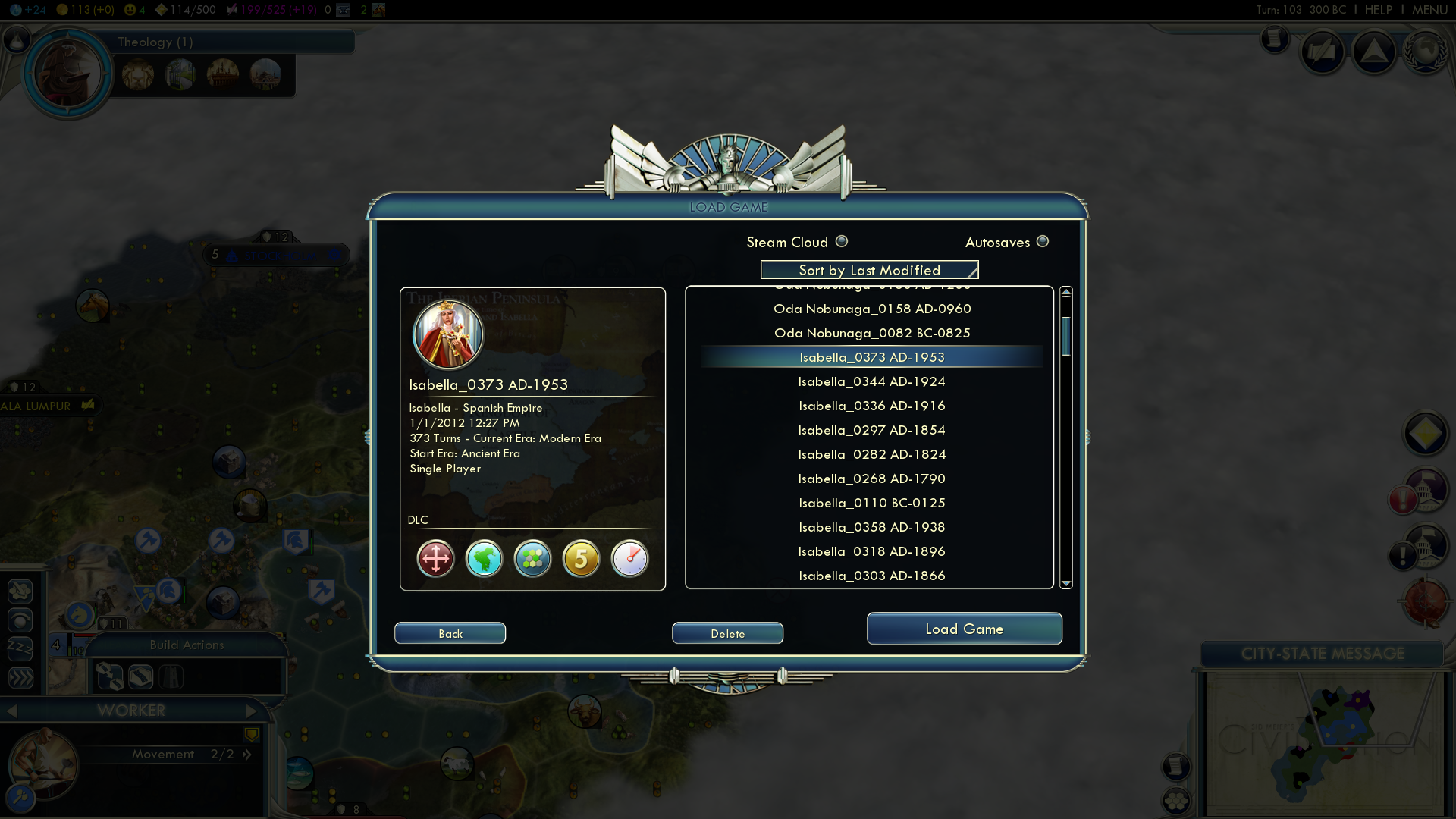
Examples of Pause Menu Screen.
It was a personal goal of mine was to make the city screen feel like the player is still in the game and less like a screen. Like the rest of the UI this screen grows over time, which helps teach the player as the game progresses.
The city screen has to modes. The player can choose to manage the cities development or have it self-automated, which is a nice feature for new players to choose and learn from.
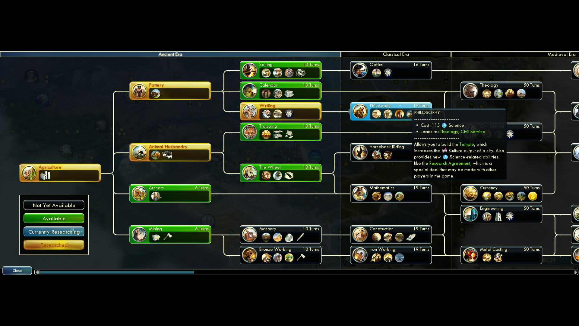
This is the one screen that needed to show ALL the technologies so the player could plot a course to late game technologies.
All other screens involving technologies grew like the rest of the UI to help minimize the complexity and teach the player.
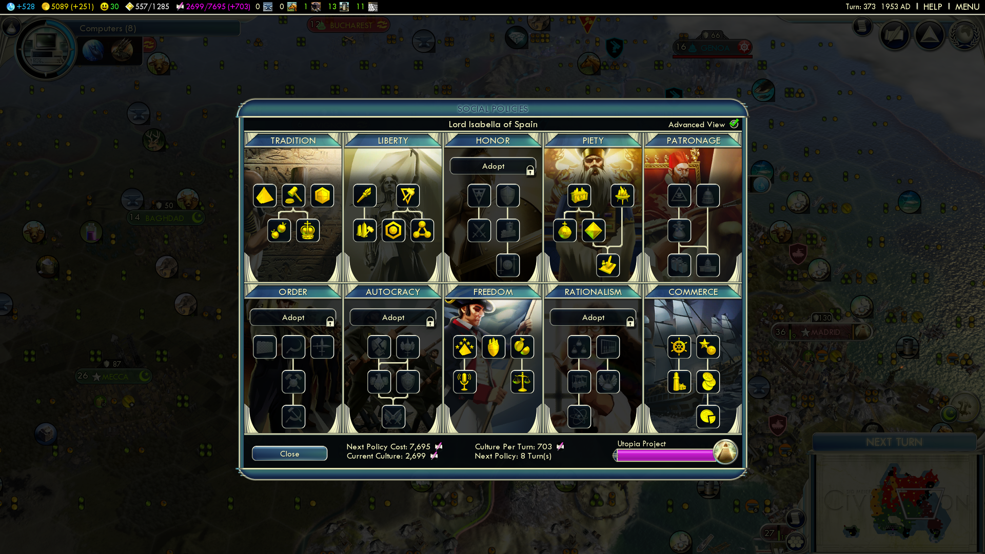
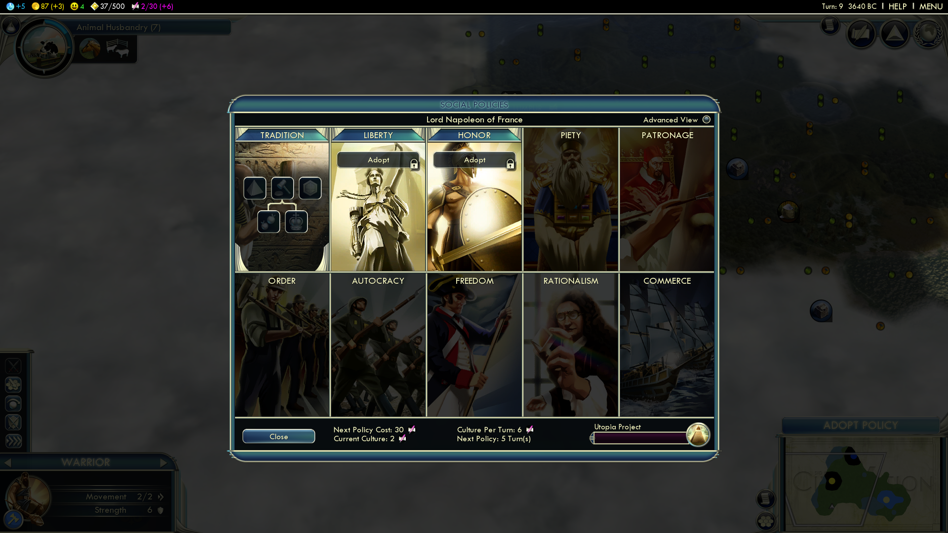
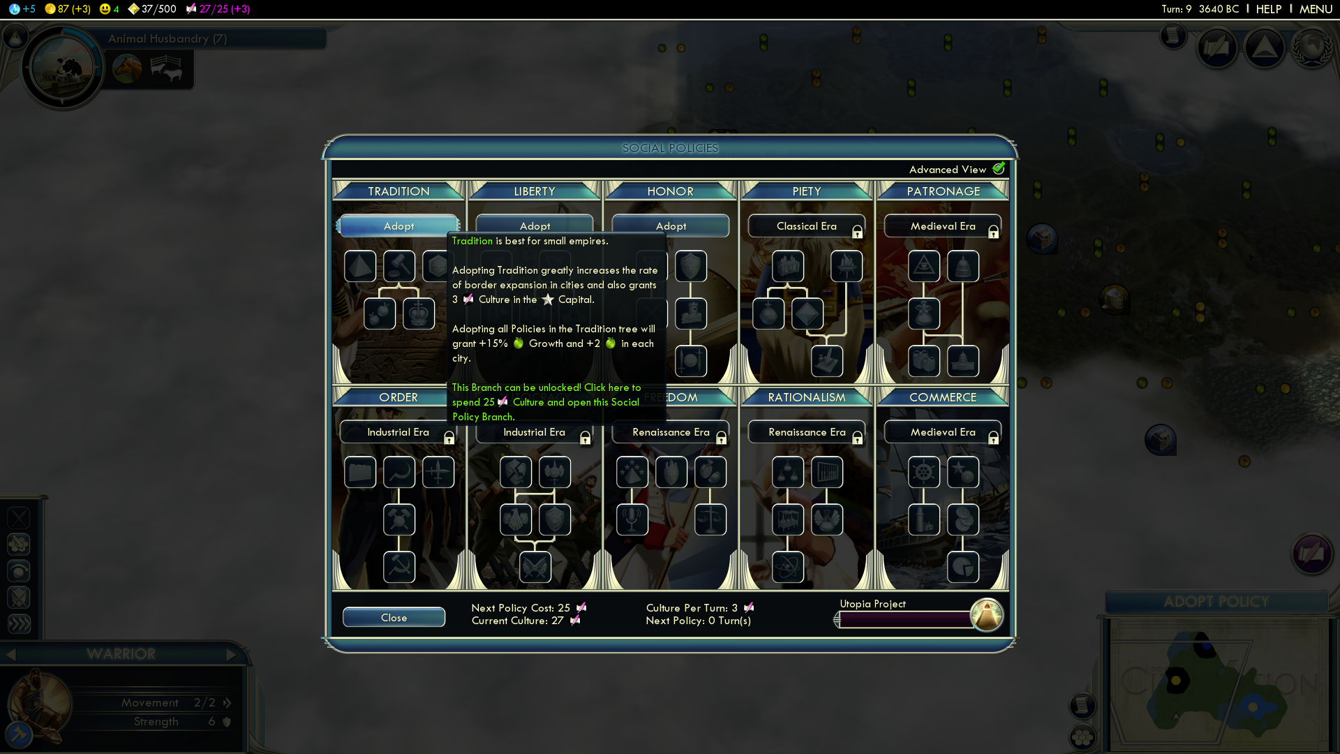
This was a new feature added to the series which added buffs that could help the player achieve one of the four victory paths. It added a lot of flavor to the game.
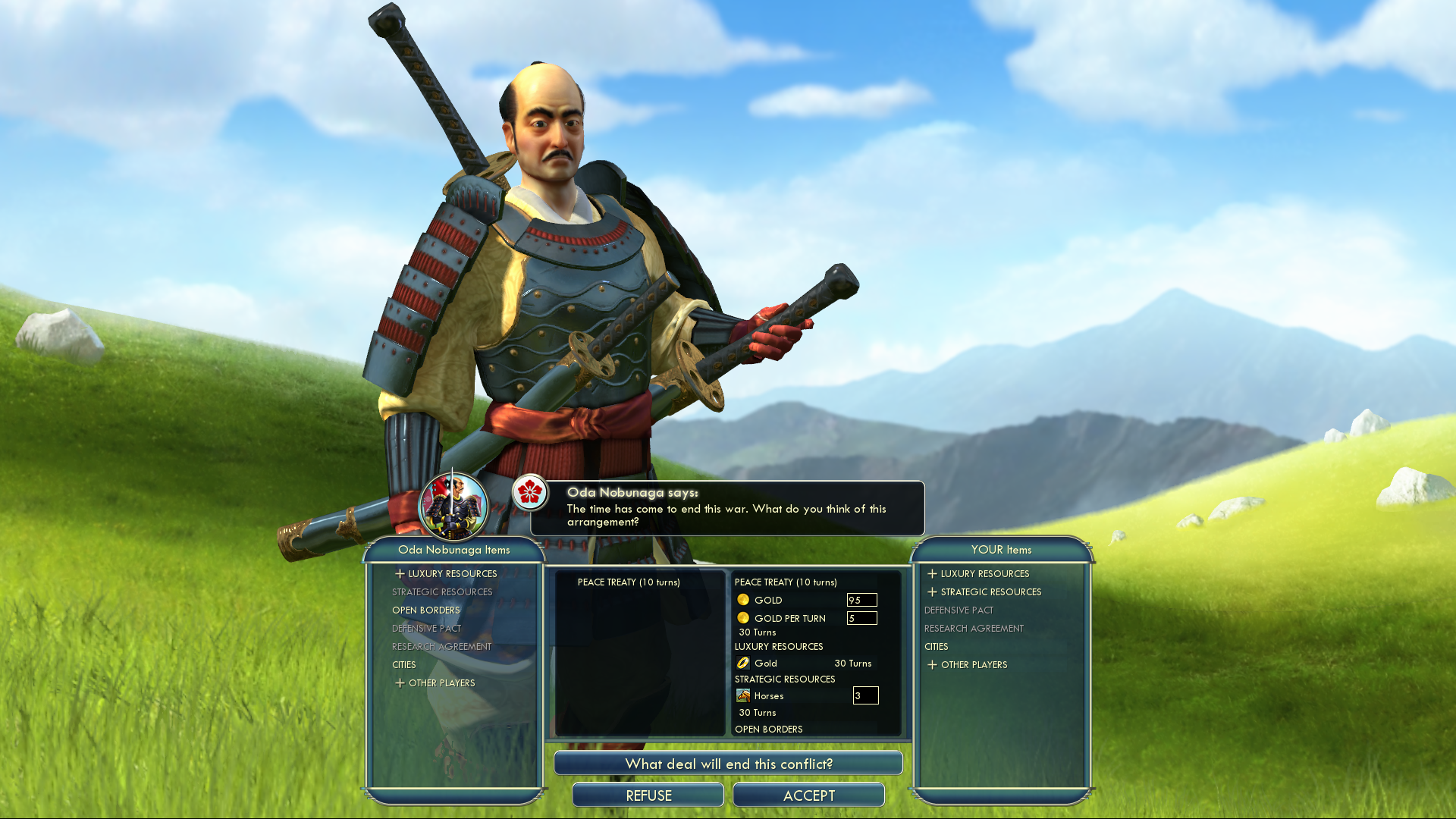
We did not want the interactions with other Civilizations to feel like a screen. The goal was to see the leader in his/her environment and to minimize the UI as much as possible to show all pertinent information.
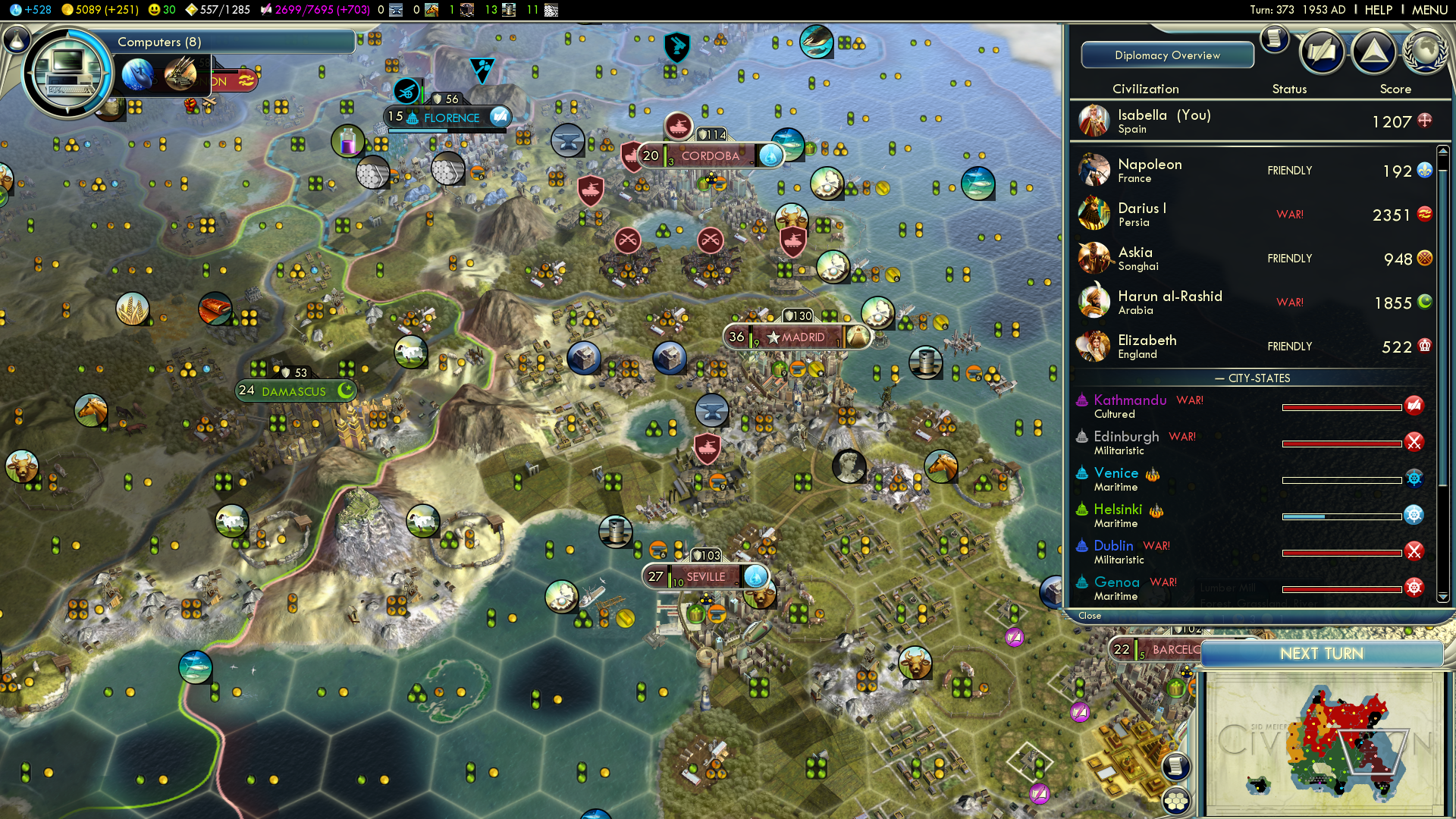
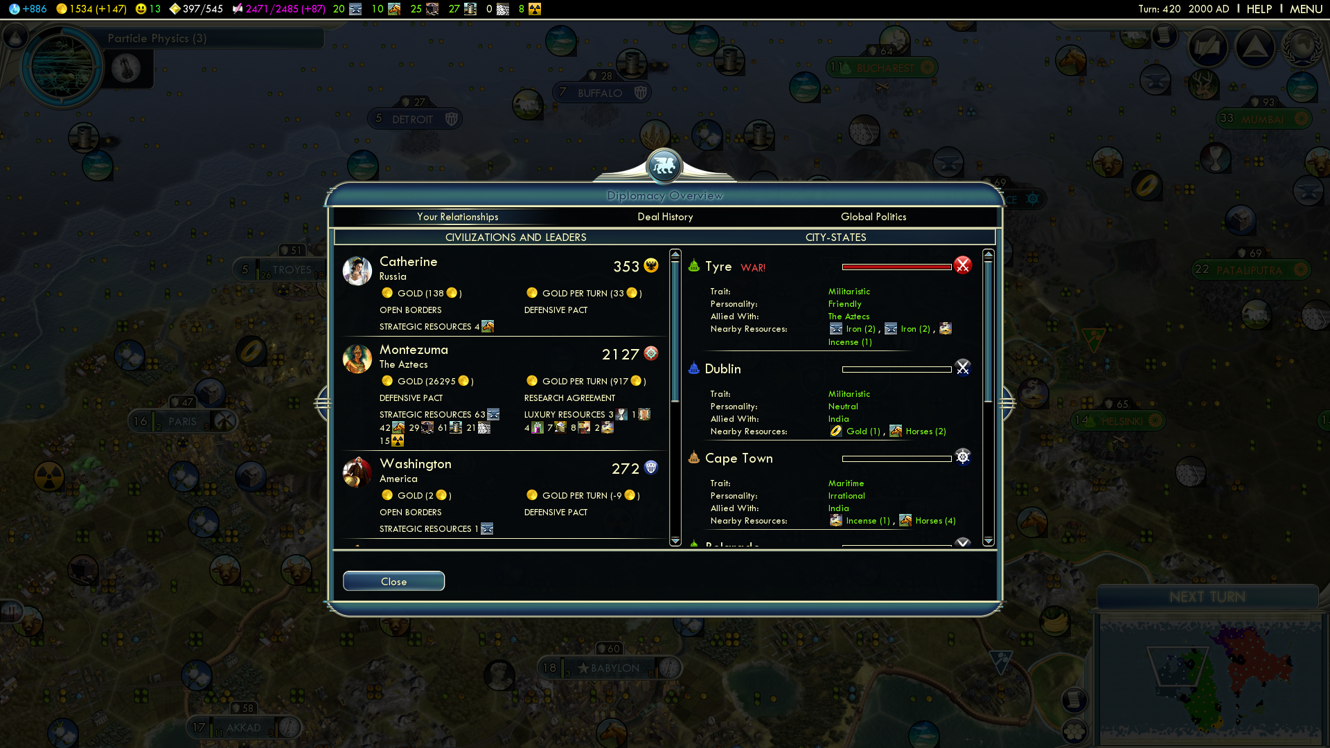
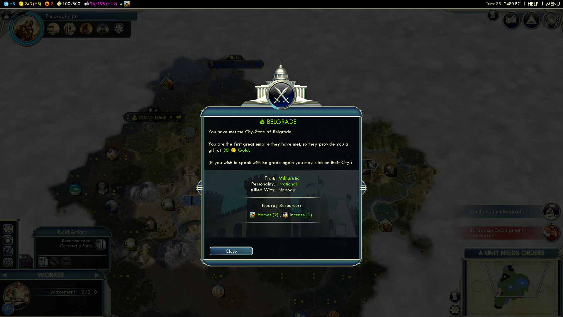
The other diplomacy screens gave an overview and progress report of relations with civilizations, leaders, and city-states.
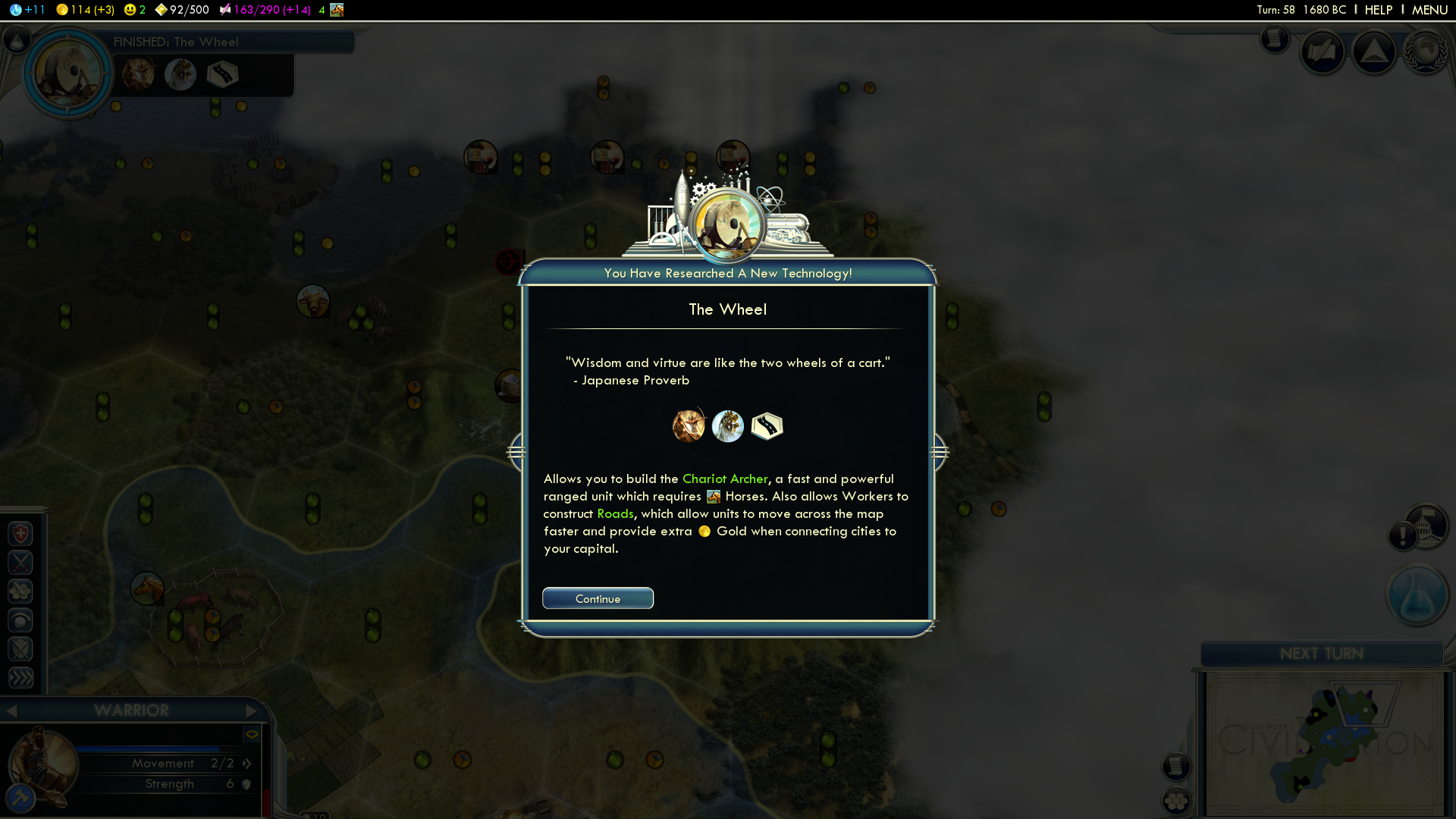
Examples of the MANY various pop-up menus that appear while playing the game.

The goal of this screen was to make it easy for the player to use. Which is why the design was based on webpages, allowing the player to immediately feel comfortable navigating. It was a simple and very successful decision.
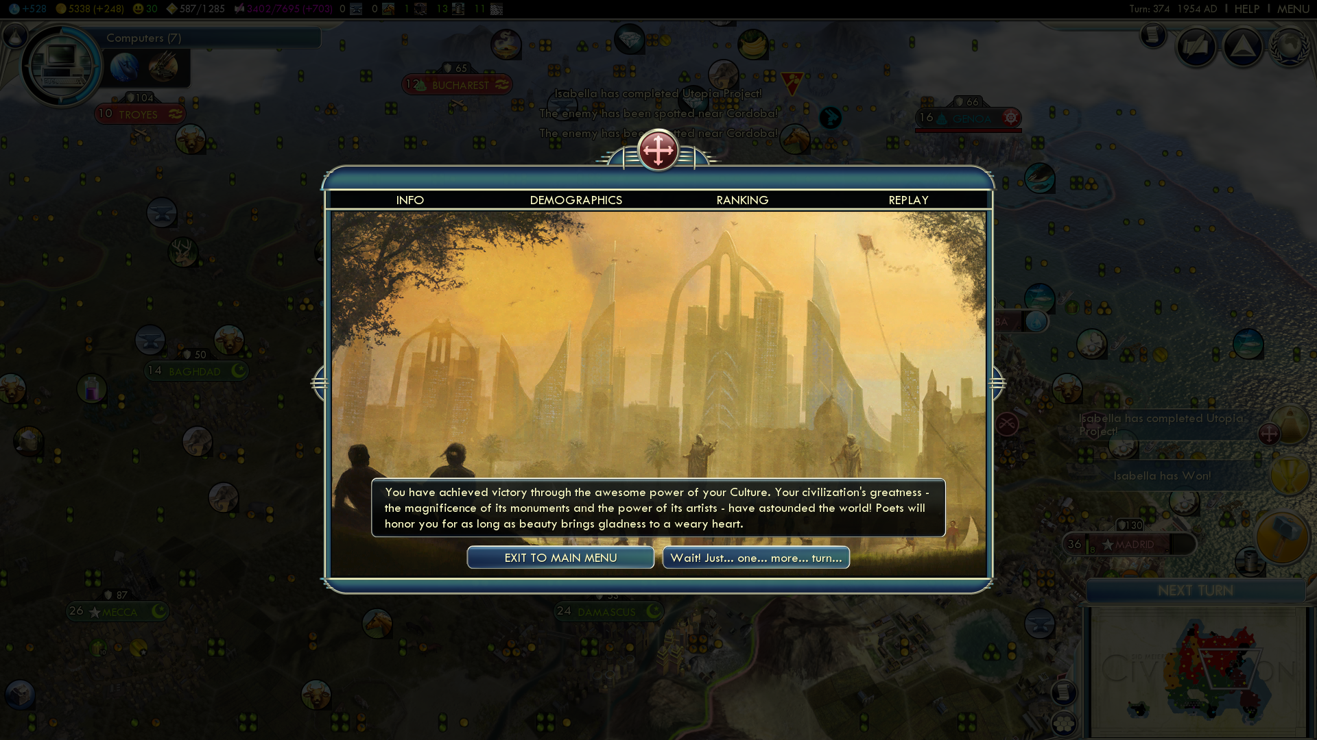
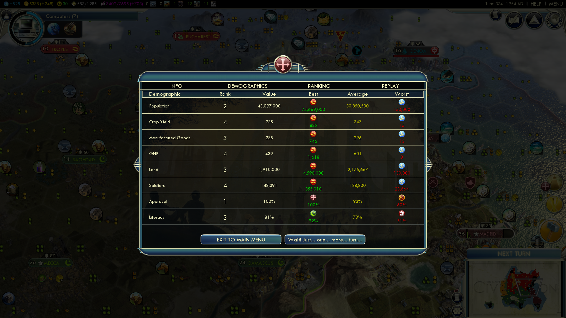
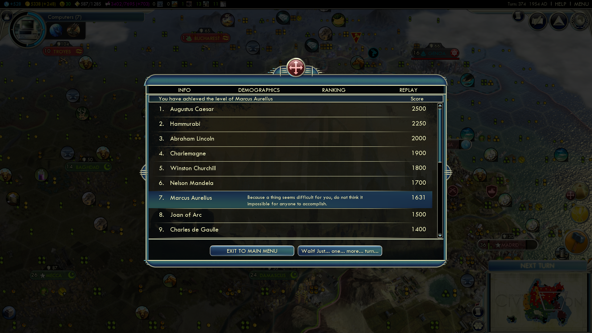
Examples of End Game Screens.