Toys For BOB
Senior UI Artist, UX Designer
This was the studios first game created using the Unreal Engine, with a one-year development time for all three games. I was responsible for the oversite of the UI from beginning to end, working with a UI engineer.
We created one UI for all three games, to help with the usability from game to game. The challenge was to make the usability similar while making them visually stand out. We achieved this by creating a color palette for each game and adding watermark logo to all the menu backgrounds. The UI is the one area that changed the most in the remake, utilizing 20 years of usability advancements and consolidating a look that could be used for all three games.
Click here to view
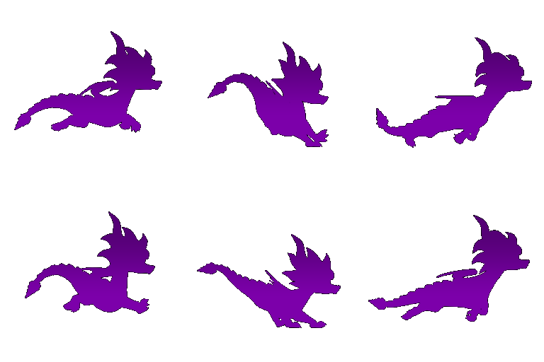
This is a fun icon of Spyro running used as an overlay in the lower right of the screen each time the game saves. Example of the animation can be found below.
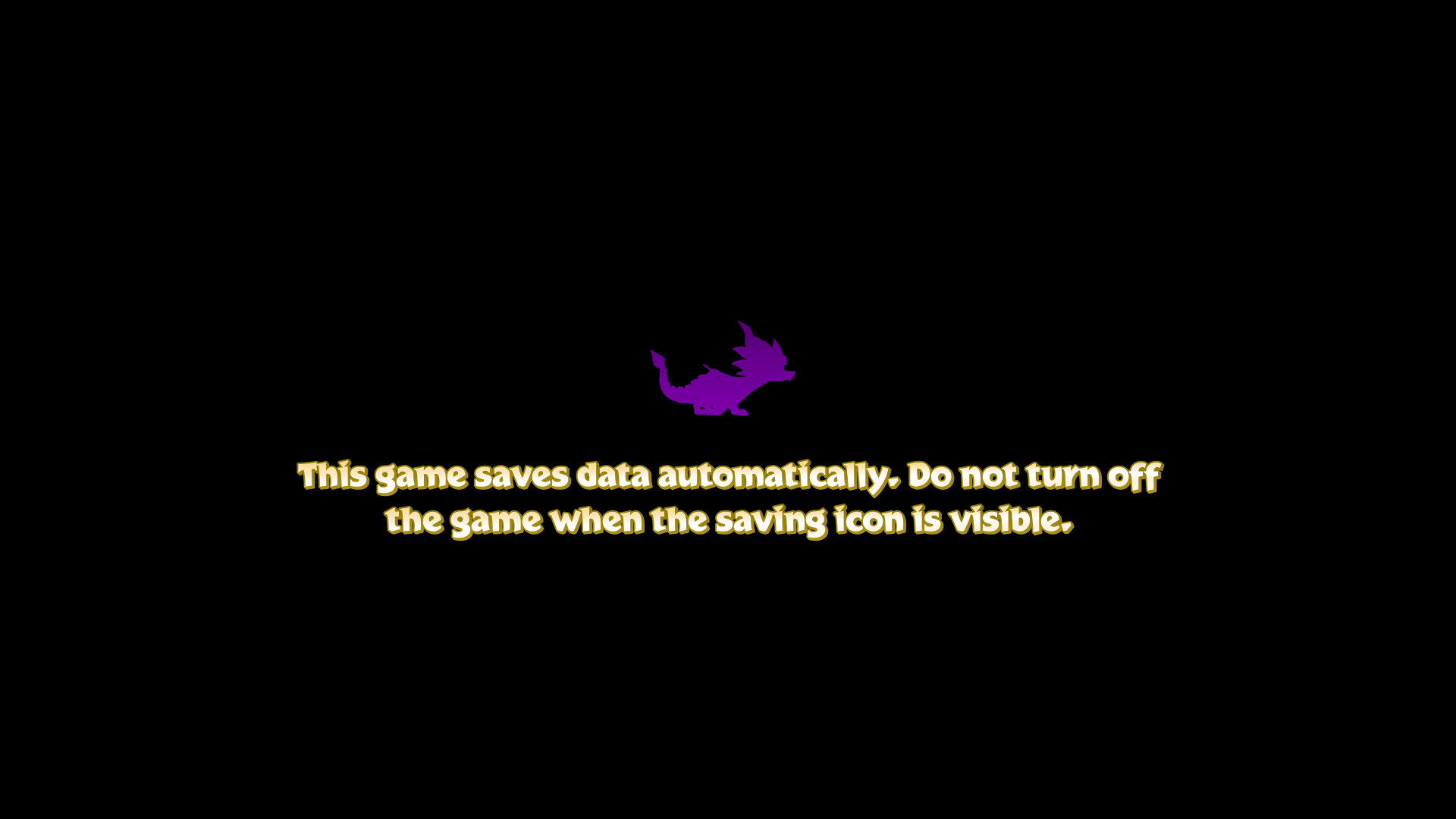
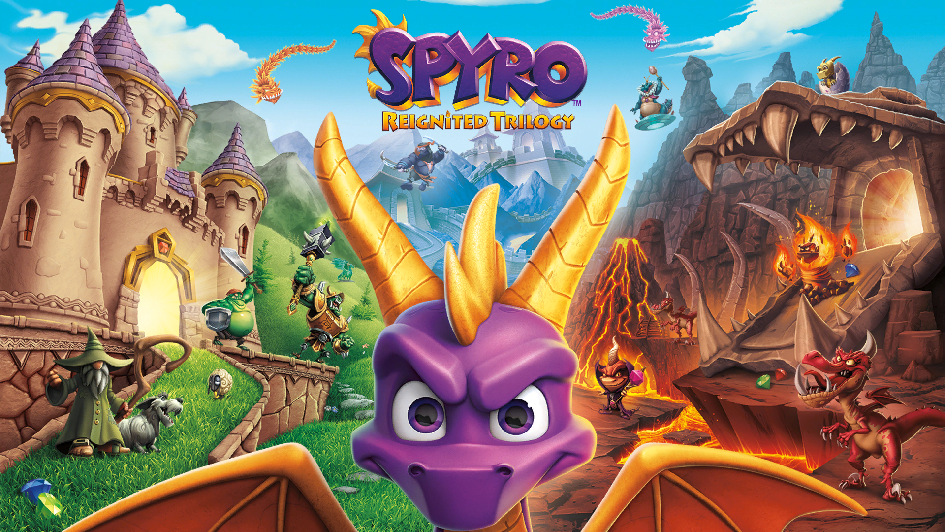
This is an image (based on the box art) that appears prior to the game loading.
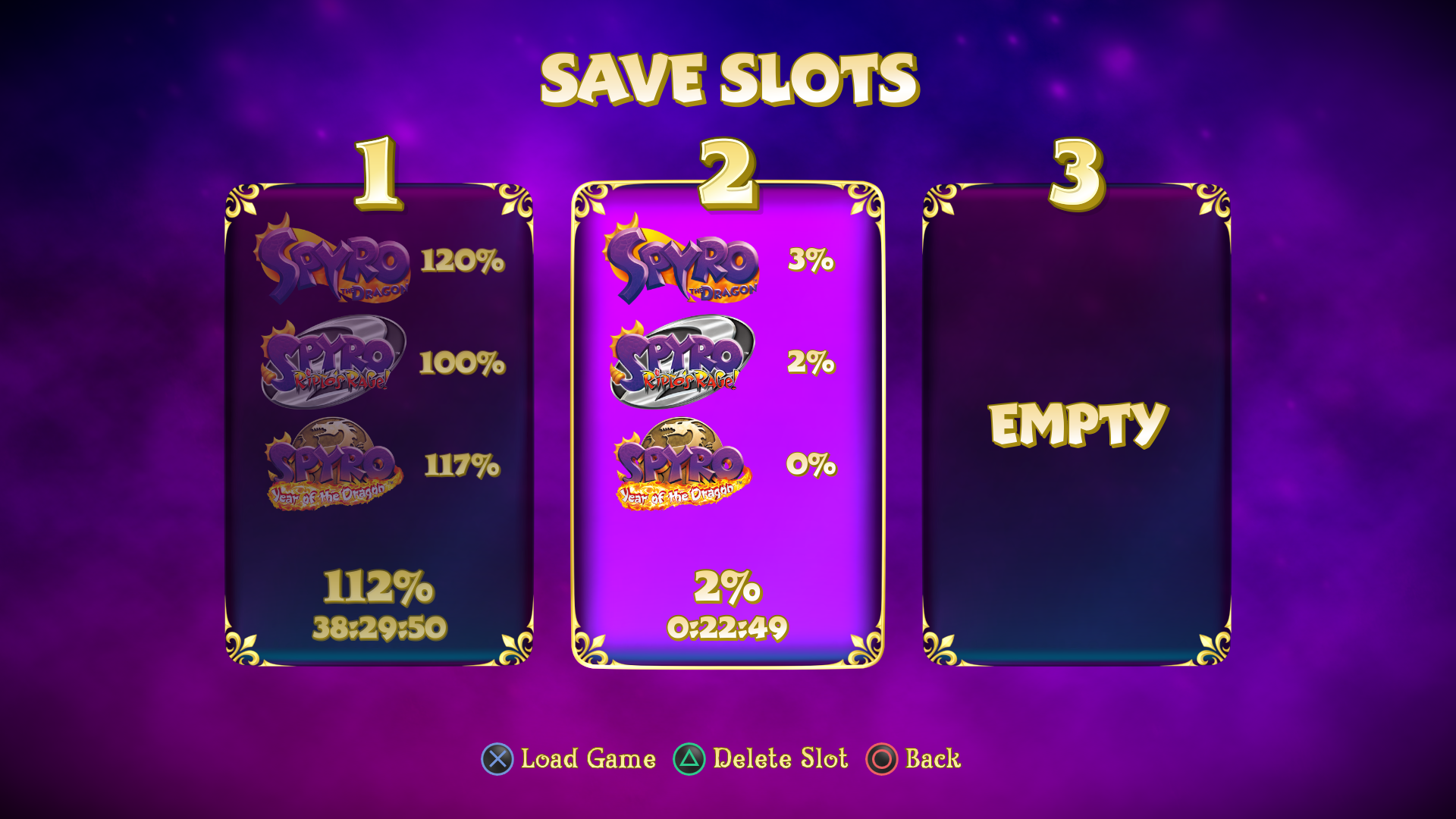
The player is directed to this screen starting the game for the first time. This screen was created as a call back to how games used to have multiple save files instead of one per player profile. The save slots have four percentage totals, one for each game and one for all combined.
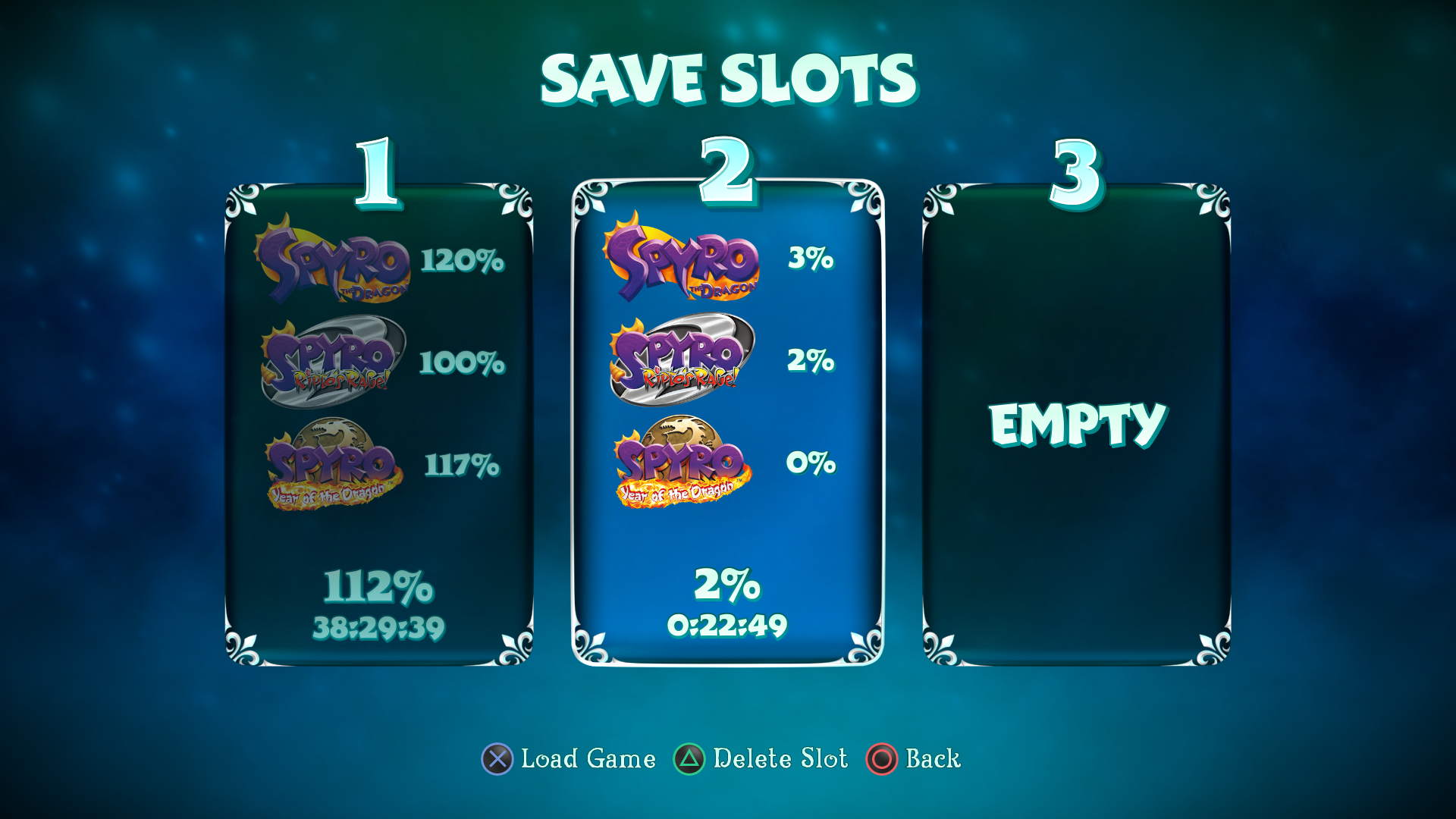
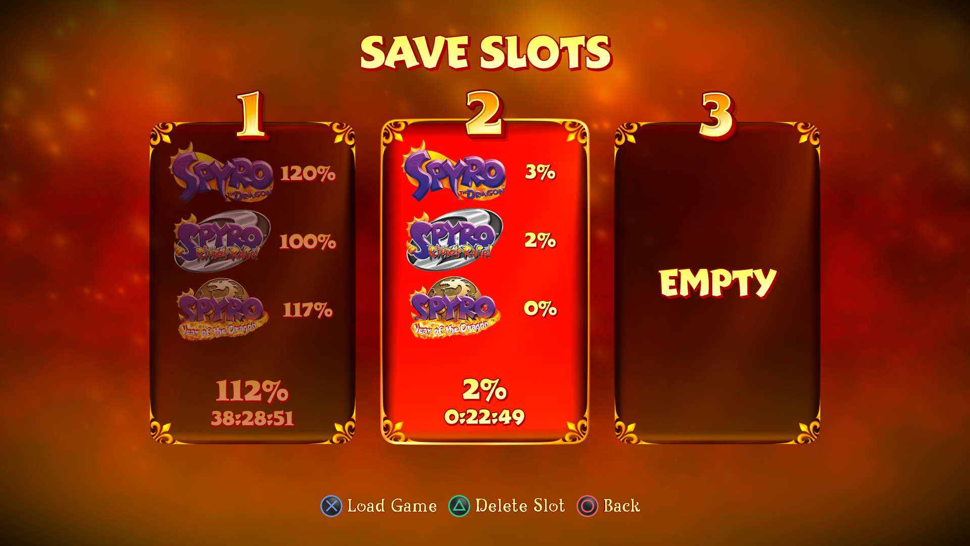
Created all the art and effects of the background, which is used throughout the game’s screens.
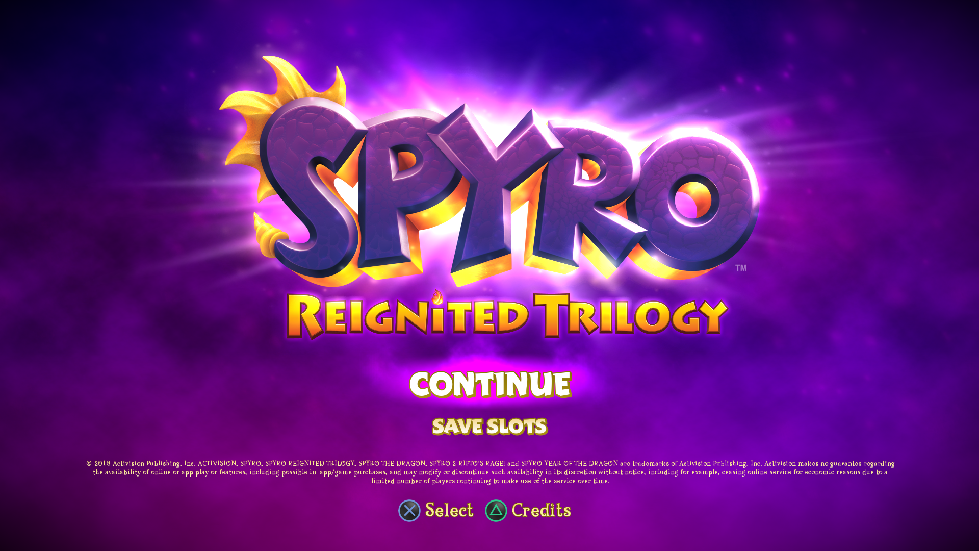


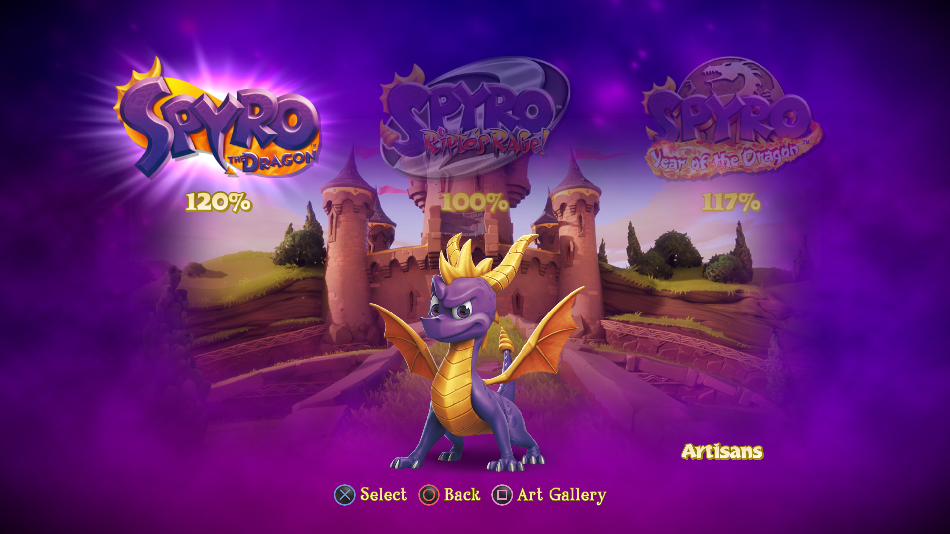
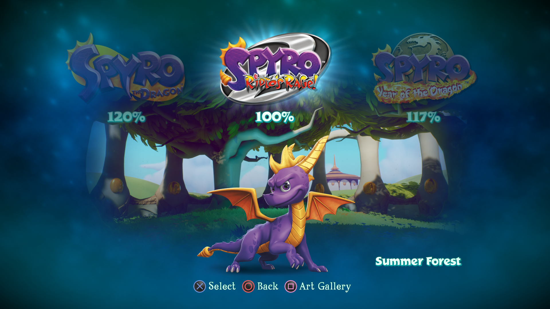
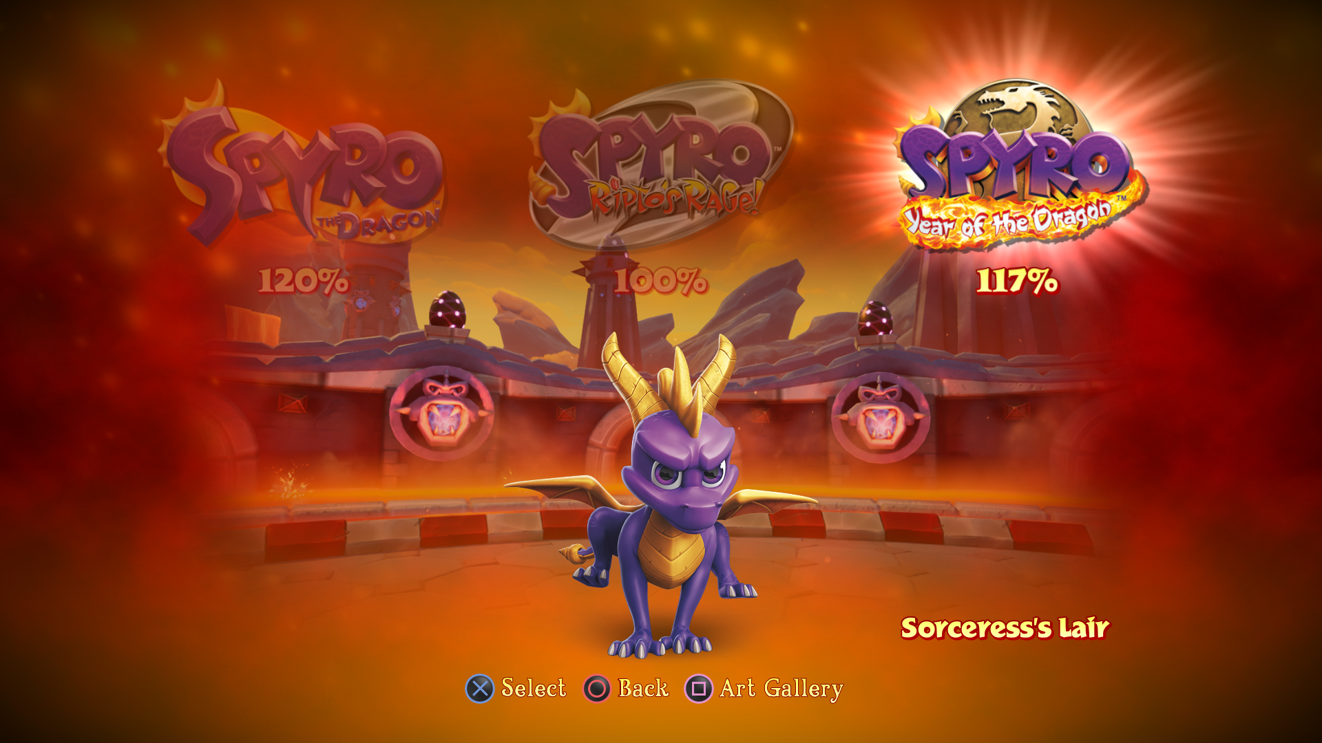
This screen was created to select one of the three games. The Spyro poses are based on the original box cover art titles. (Examples are shown below in the Gallery Screens). Each game has its own menu color palette. The backdrop images reflect the most recent level played.
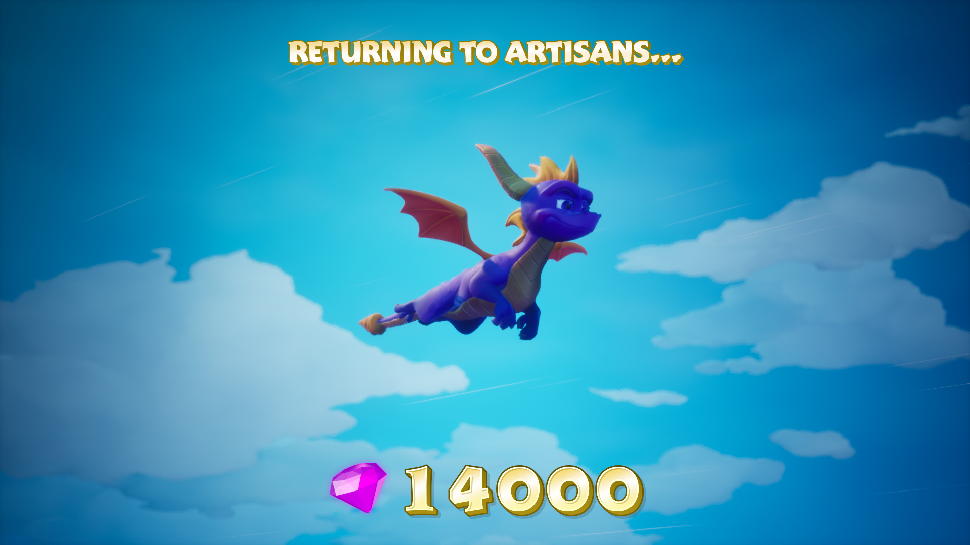
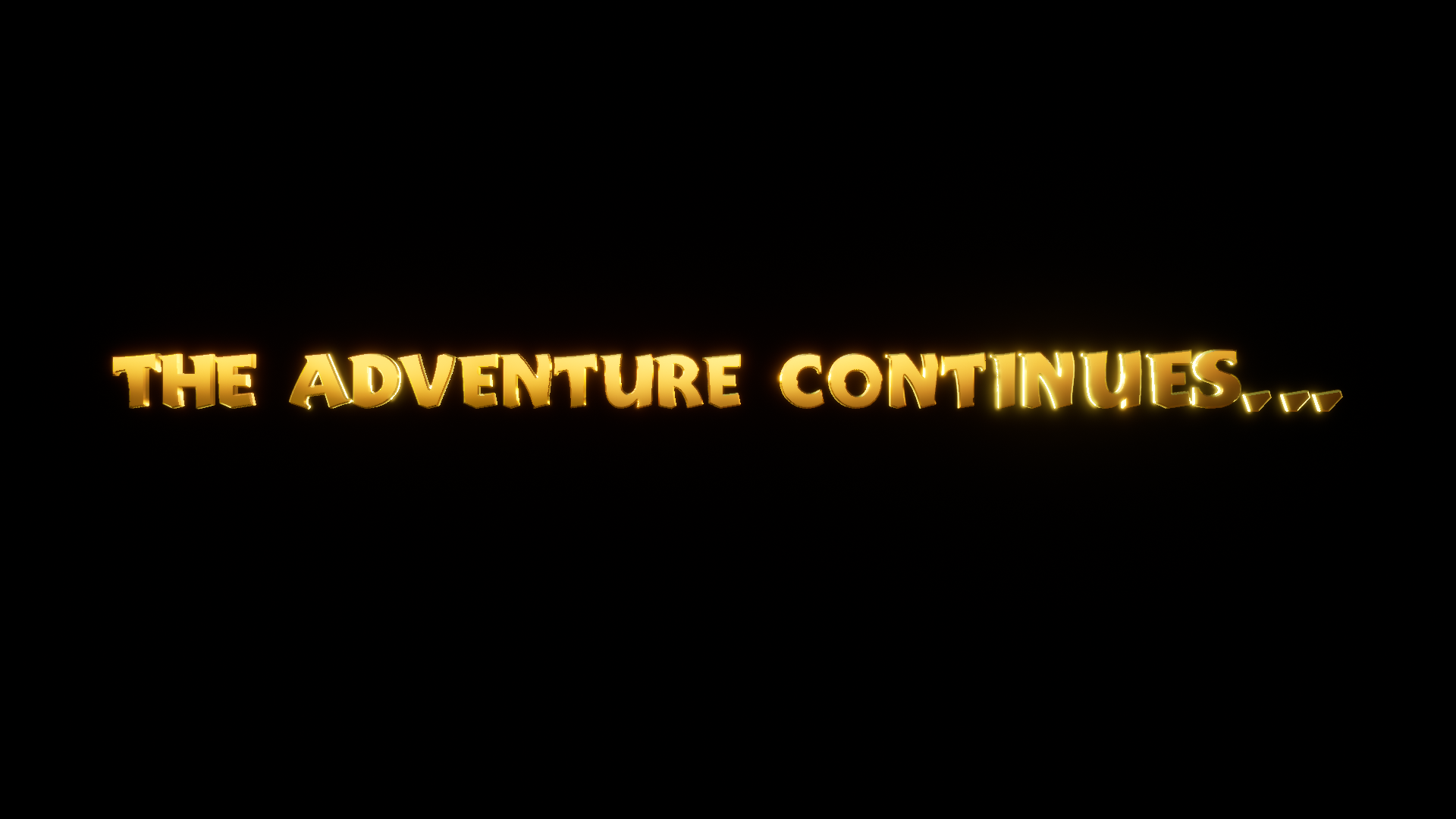
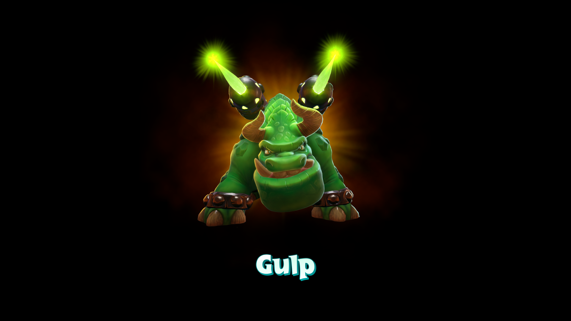
This game has three types of loading screens which are based on the original games. The first one keeps the focus on Spyro transitioning between levels for a seamless experience. The second one starts with Spyro flying on a black screen to reveal a short text message when coming from a menu screen. The third reveals a portrait image the boss Spyro is about to battle.
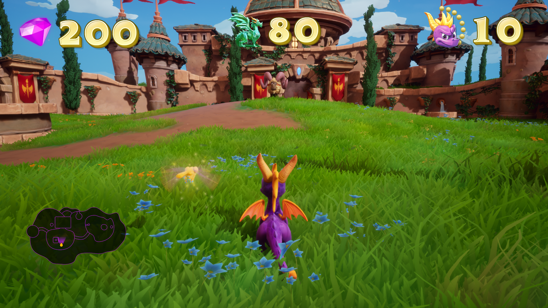
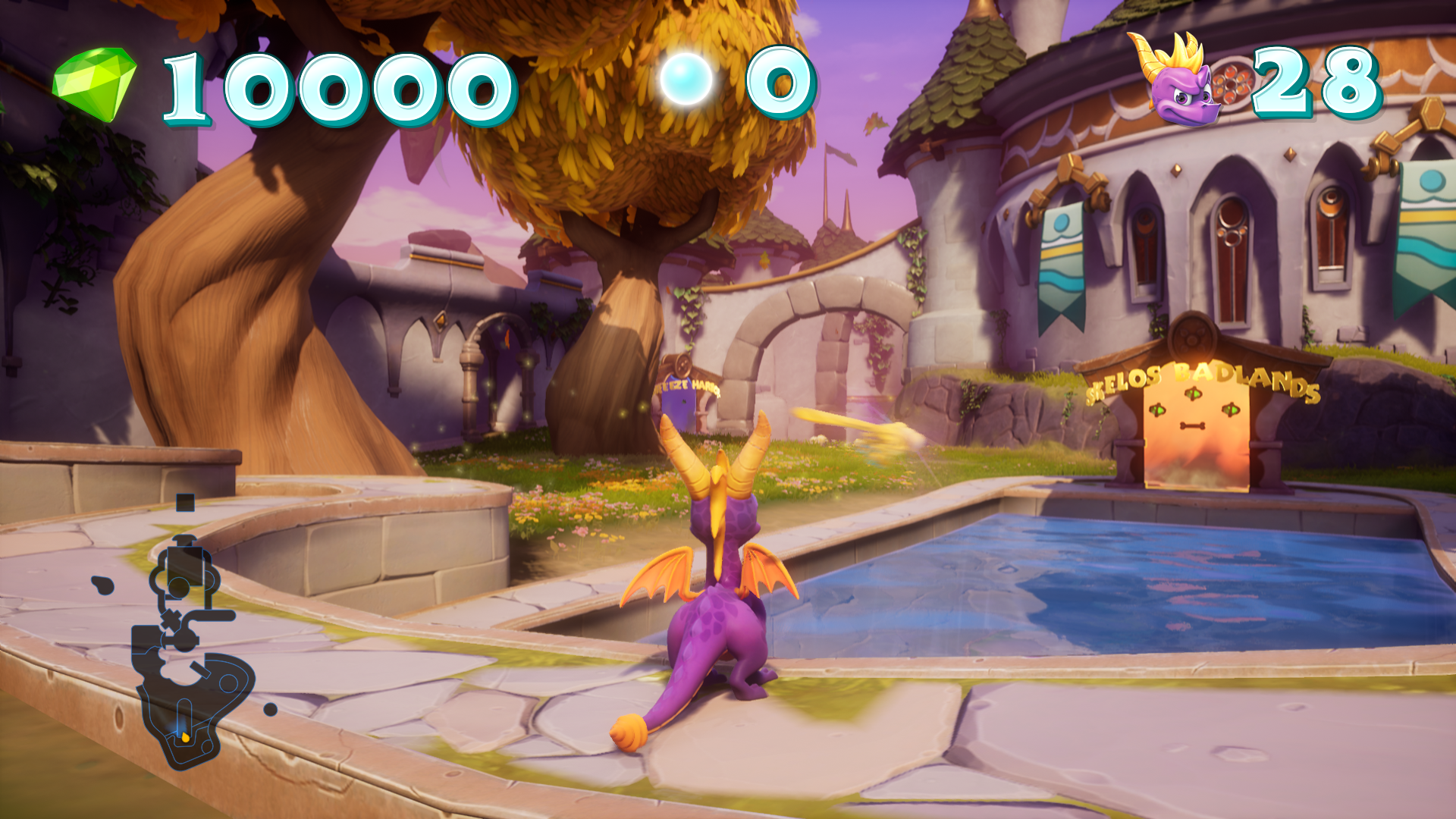
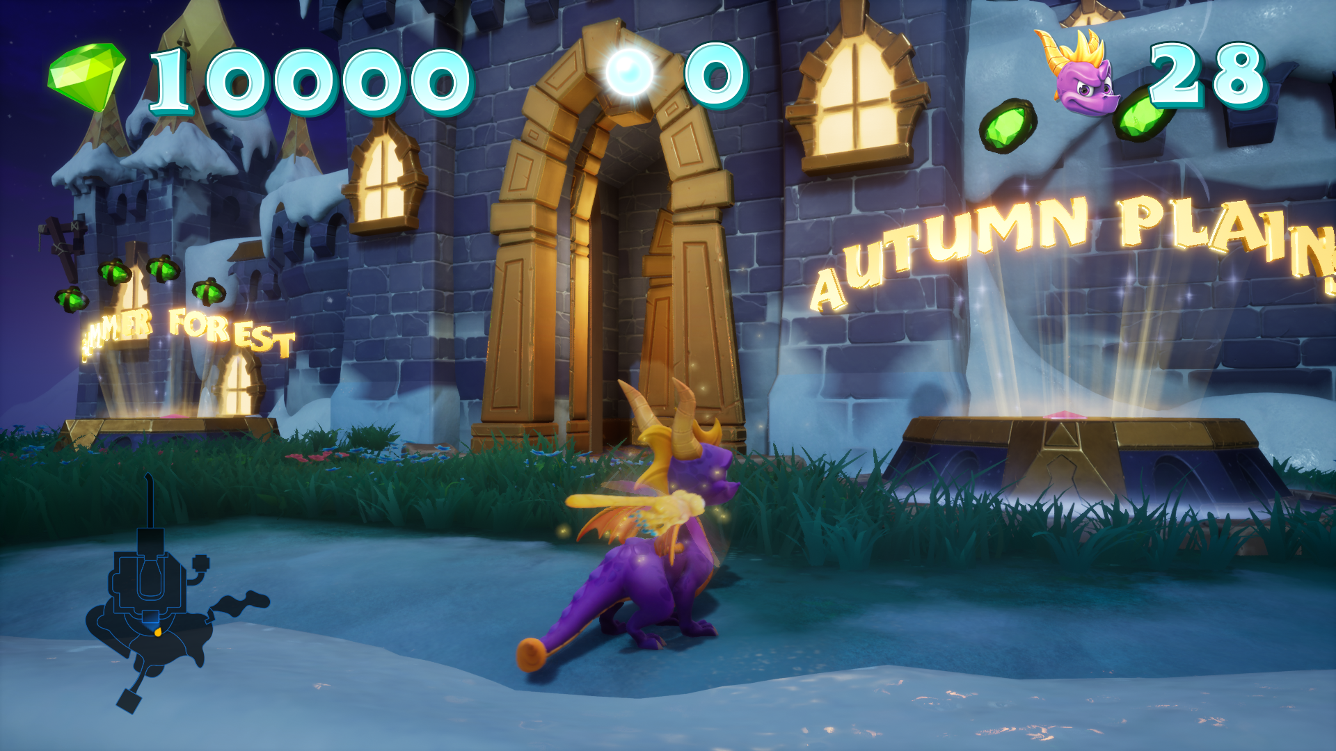
The HUD was created so that all three games felt similar while also be distinguishable at a glance. This was accomplished by changing the menu and gem colors. Each game also has a unique center icon.

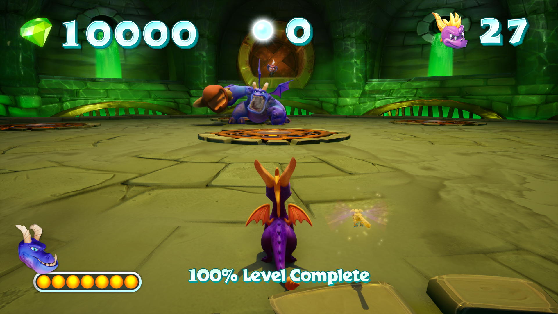
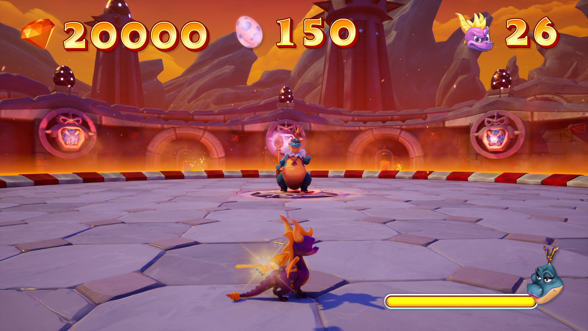
The boss HUDs where created to reflect the original game layout and style. Here are some varying examples.

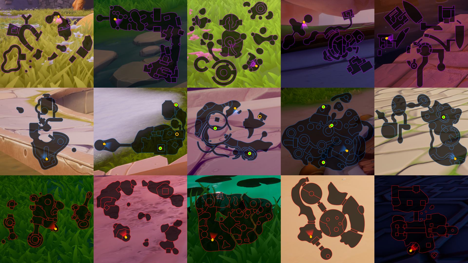
Mini maps where added to all three games even though they were not in all the original version. We did not have an automated way to make these mini maps. The process required paint overs of top-down screenshots which required a lot of back-and-forth work in game to make sure all the elements fit correctly. These were worth the work because the maps are so helpful in the overall gameplay experience.
The background shows a Spyro pose and game logo unique to each game. These are added in addition to the different menu colors to help communicate which game is being played. Screens were created to view varying bits of information (per game) in roughly the same areas.
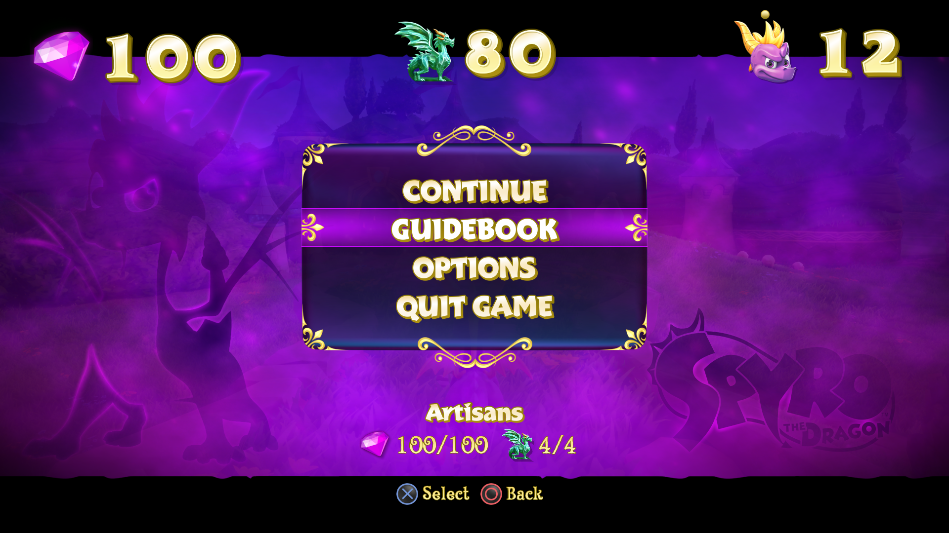
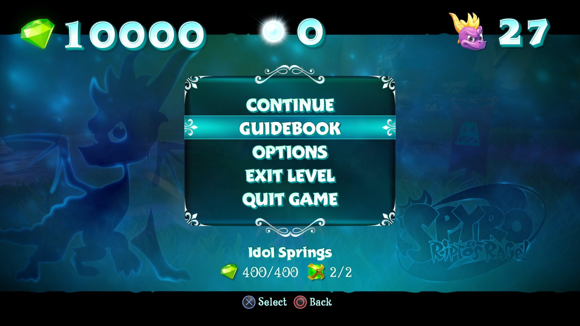

Here are some examples options screens from all three games.

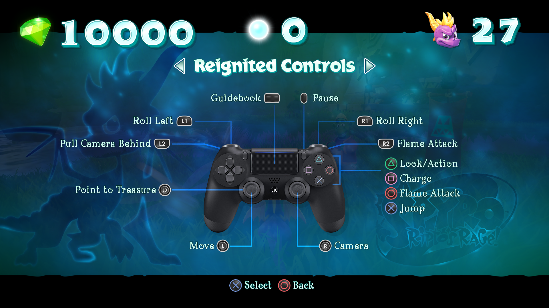
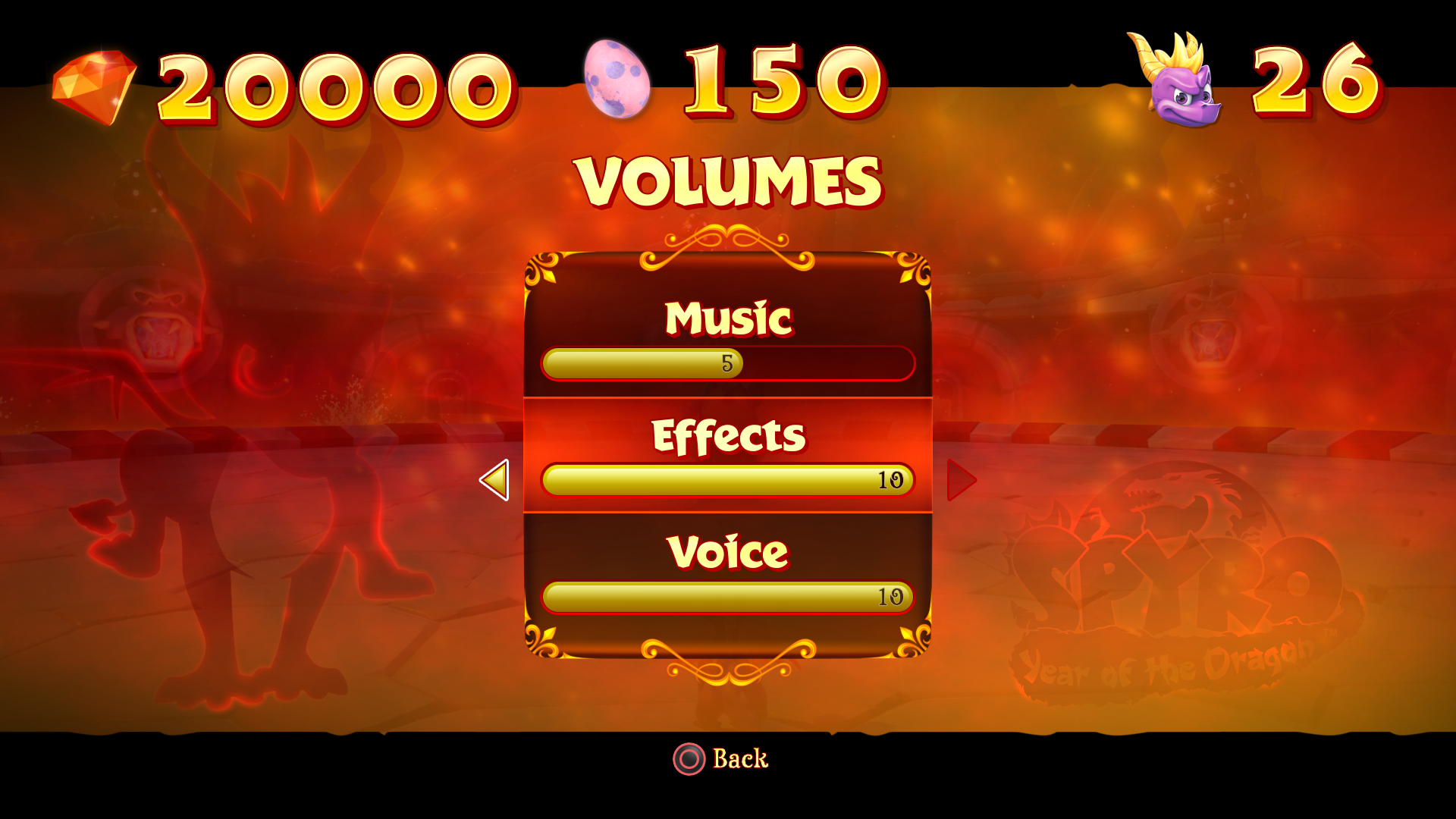
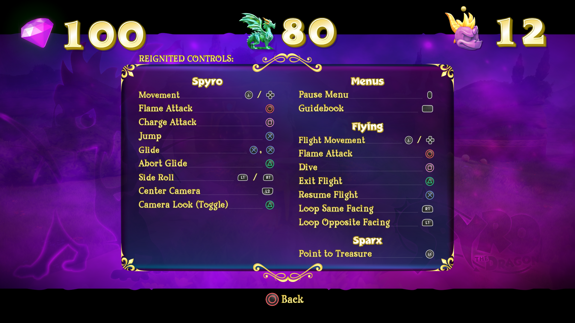
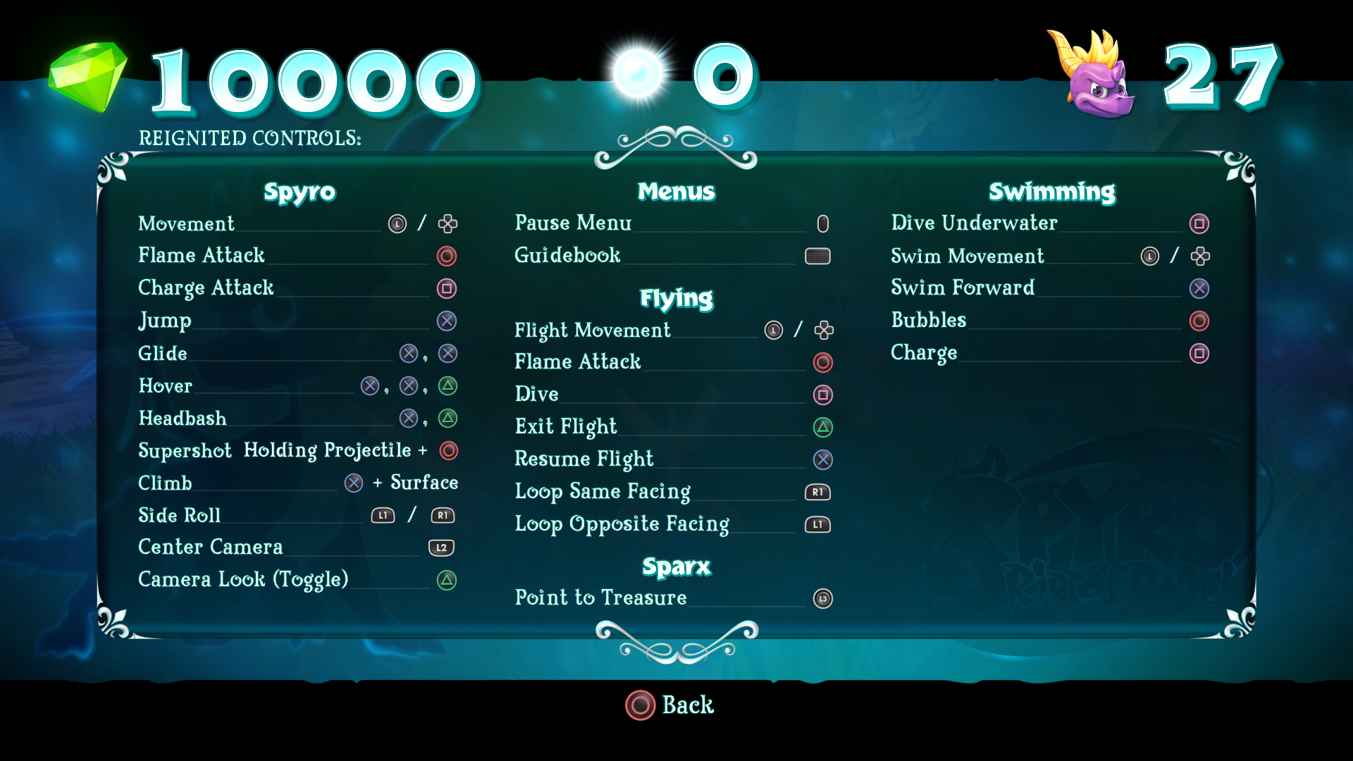
Examples below show how the screen was used to show varying degrees of information per game.
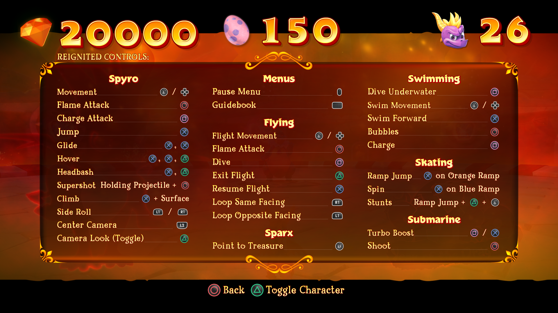
This is the most useful screen in the game, allowing the player to view game totals, level totals and fast travel with ease. Each game had its own version (Inventory, Guidebook and Atlas), which needed to be redesigned so that one layout worked for all three. It is easily accessible from pressing the back button on controllers while in a level or from the pause menu. A couple highlights, we were able to reduce the page depth from several pages to one and added fast travel, both helped the usability of gameplay tremendously.
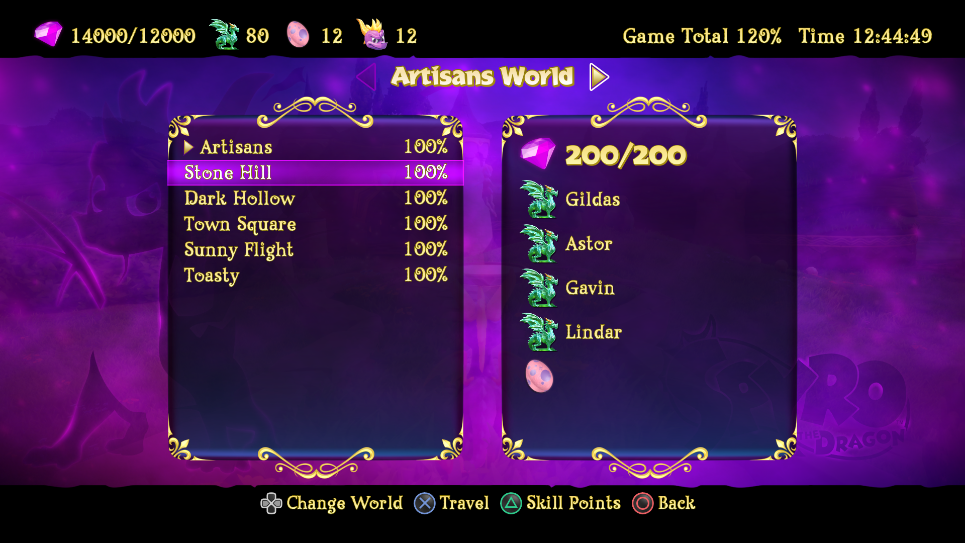
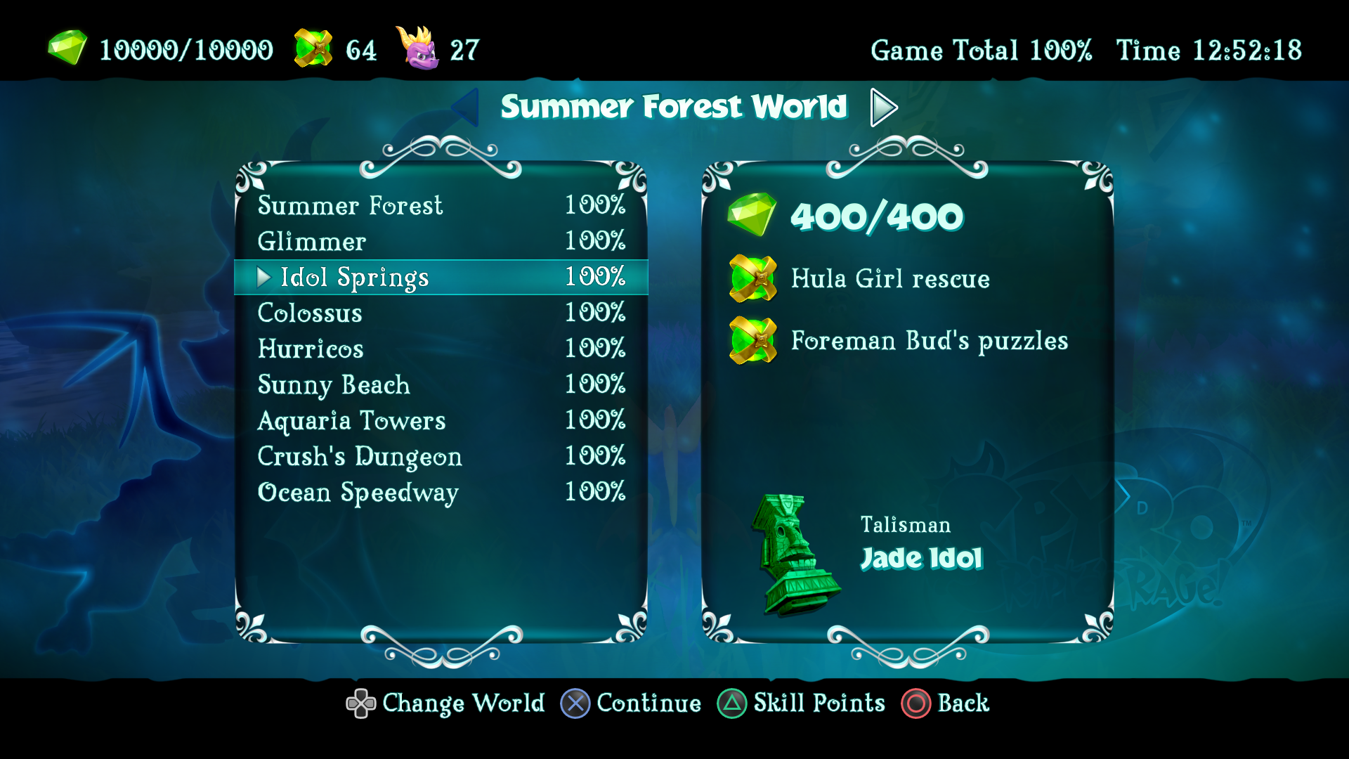

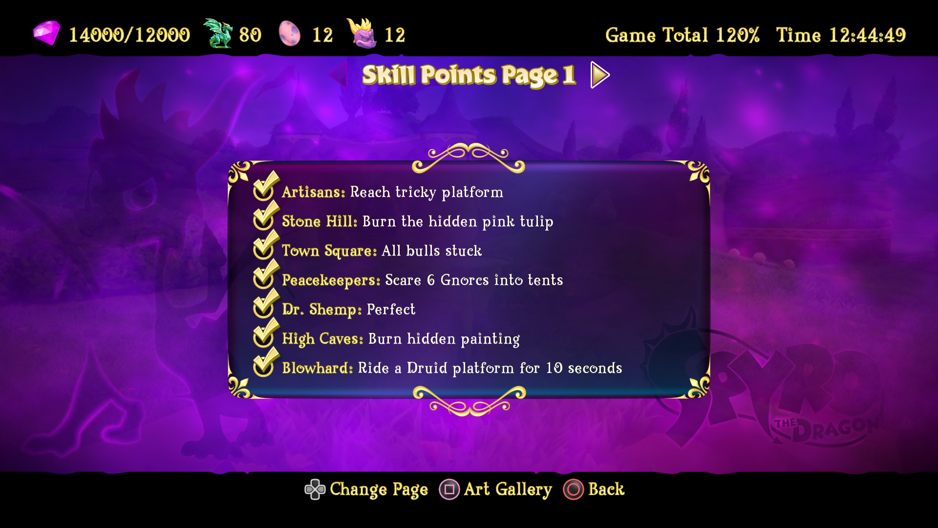
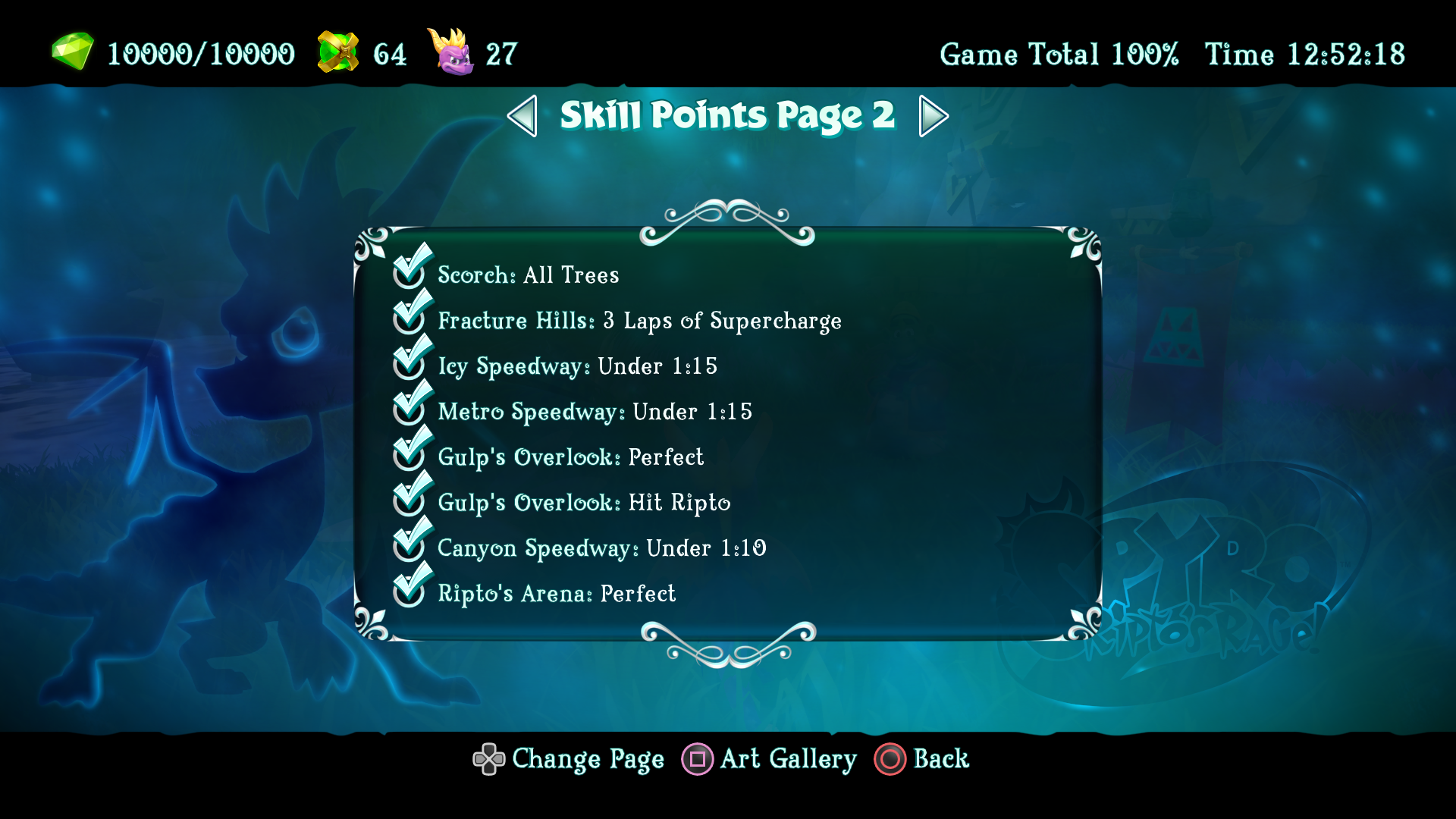
Skill Points were created as a chase for the players prior to the console Achievements. Screens where created to show varying degrees of information, per game. The last page shows updated info on Art Gallery progression.
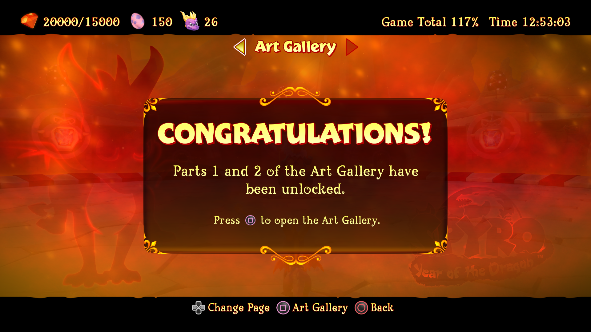
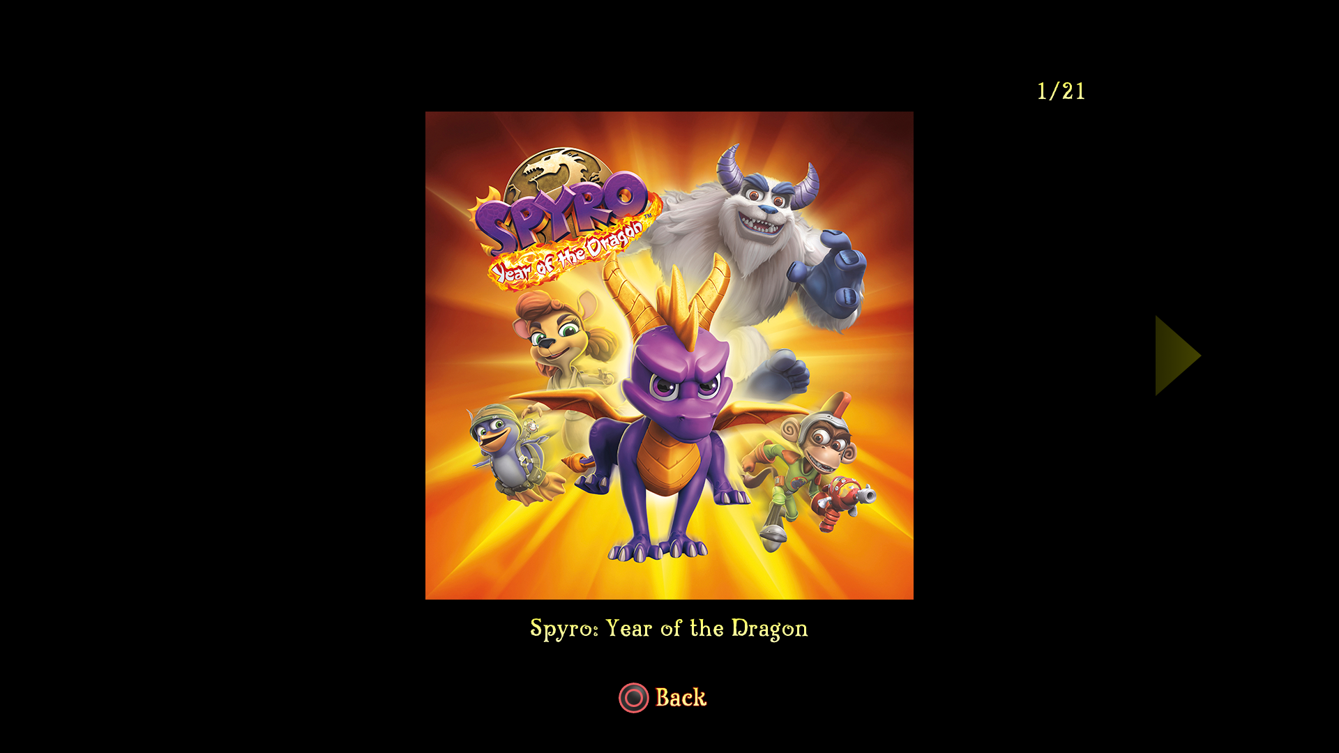
The original games showed retrospective screenshots of the characters after the game was completed. These images where replaced with concept art for the remakes. Here are some examples of those pages. The images below were recreations of the original box art. I helped the marketing team oversee the creation of these images.


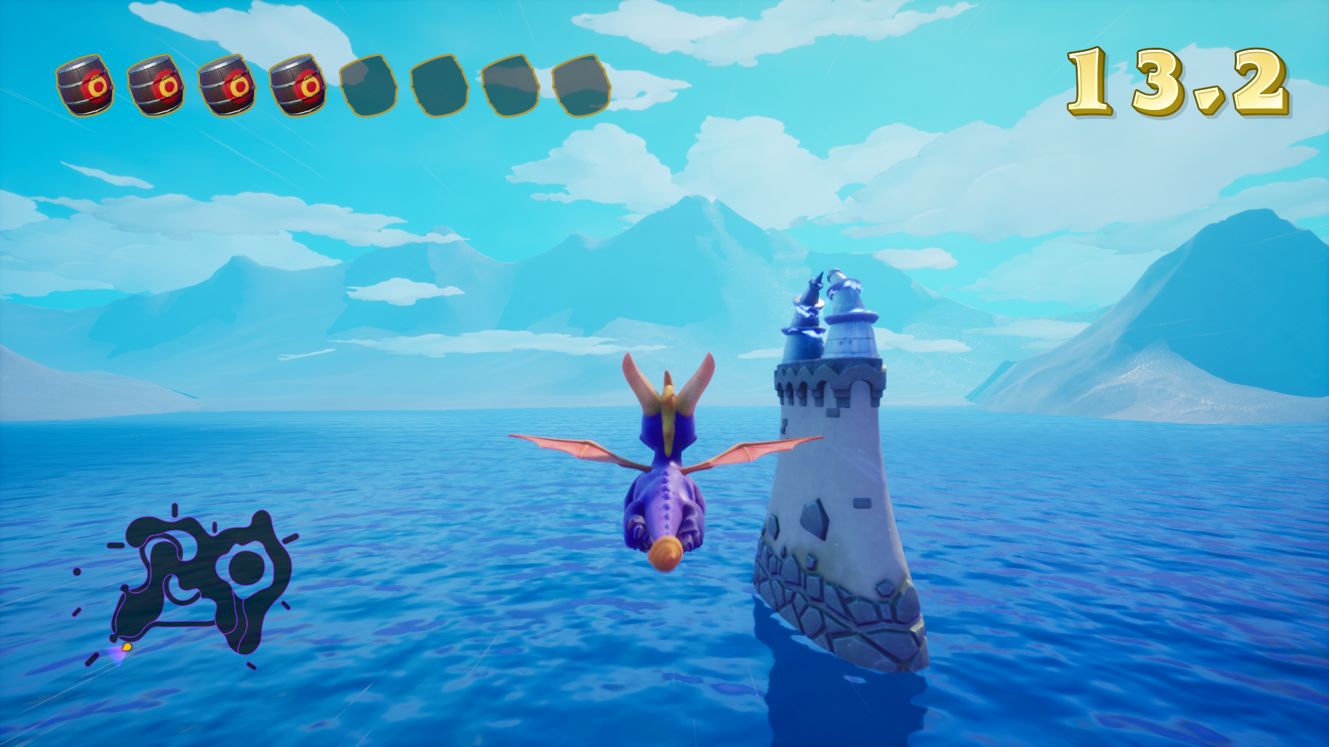
Examples of the Flight HUD and screens.

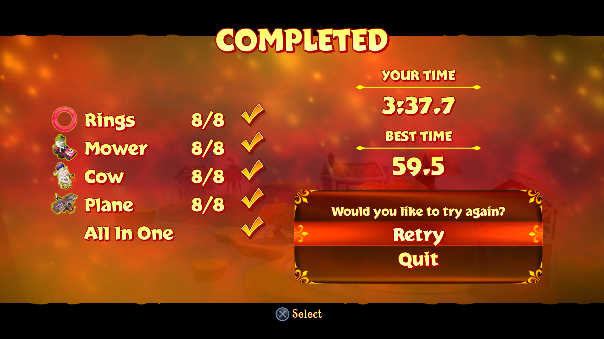
Examples of in-game button and dialog containers.
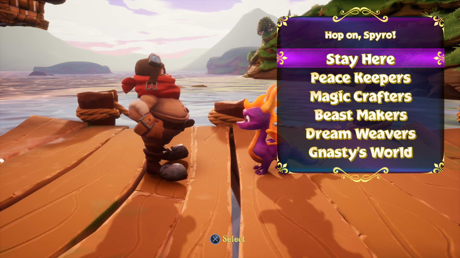
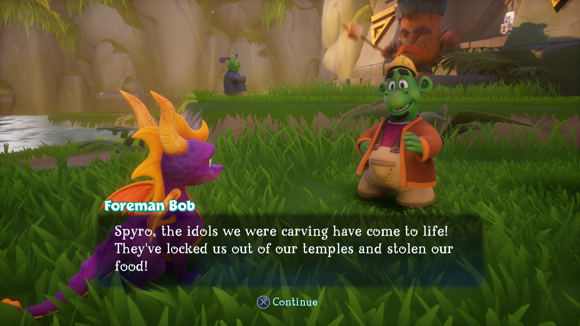
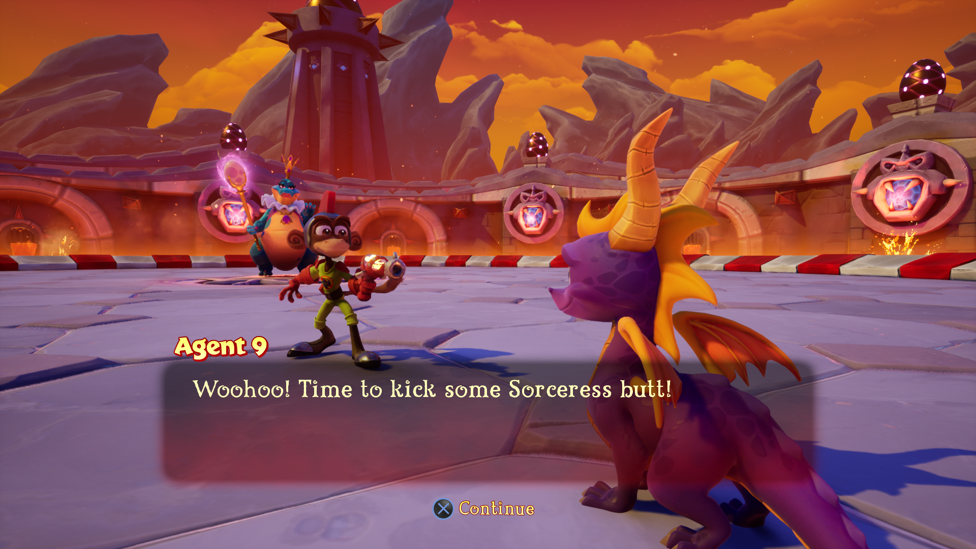
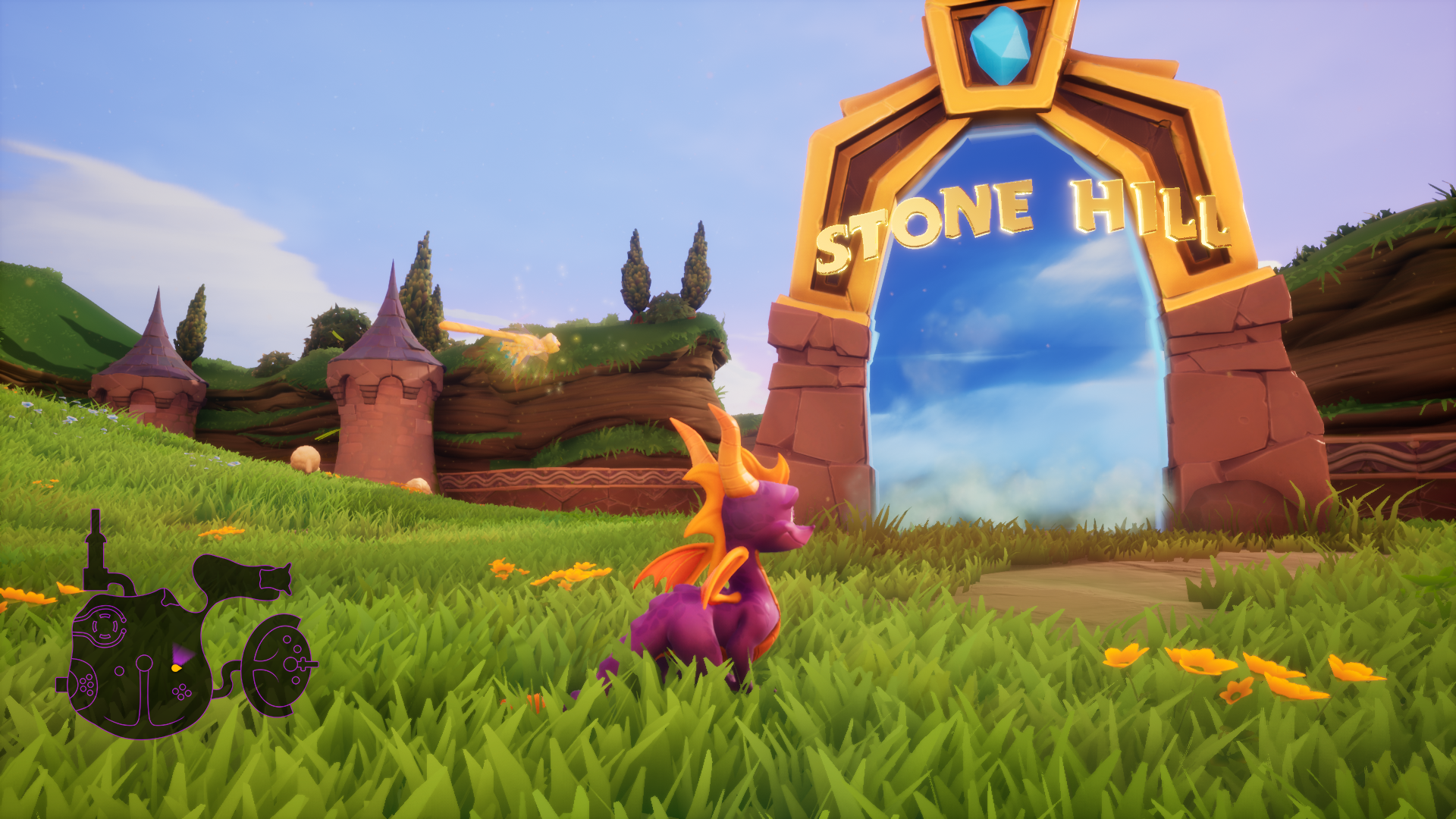
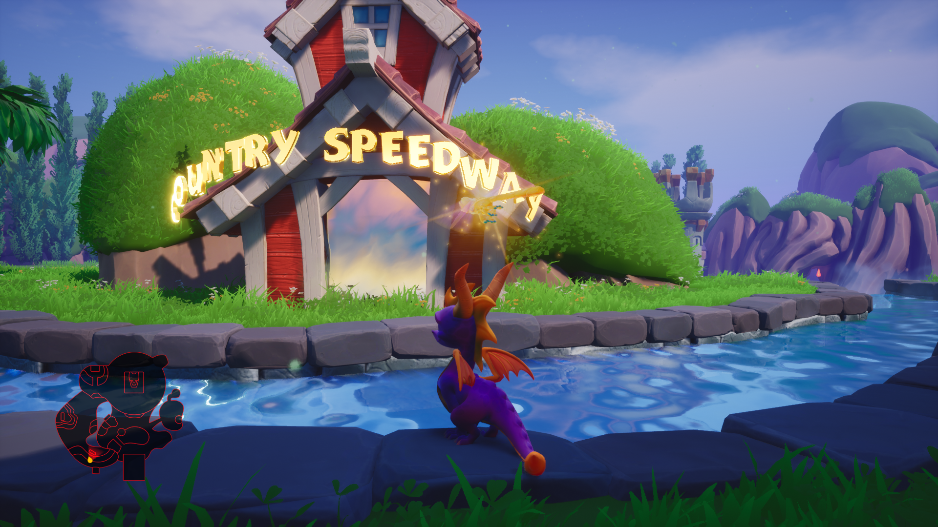
Modeled the 3D letters and created a golden metal material that included the alternating bouncing animation. Worked with engineers in creating these level labels.
Worked with marketing team in creation of the game’s logo.
Portrait, Talisman and Orb icons.
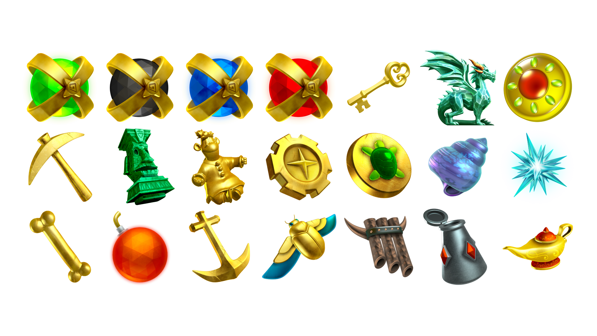
Flight and Objective icons.
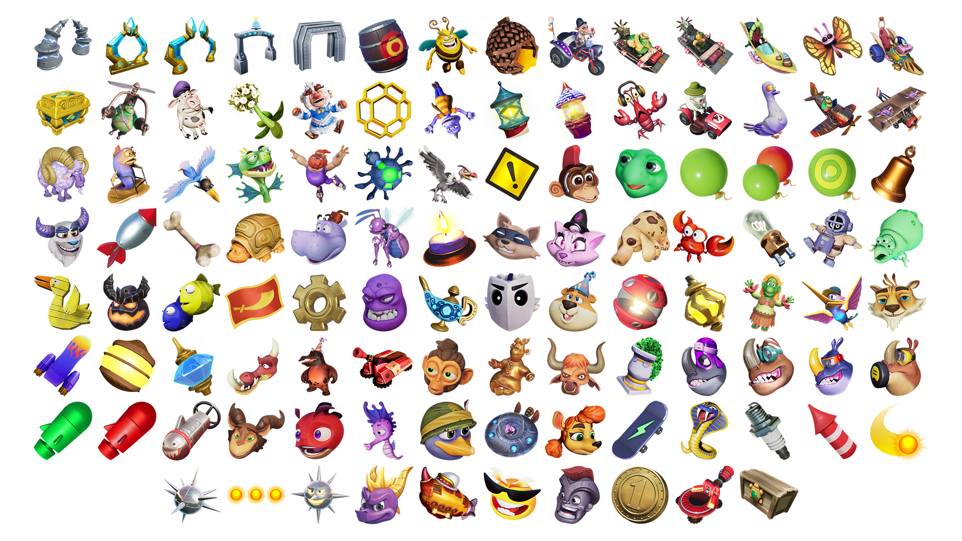
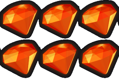
Gems, Dragon Egg and Spyro Portrait

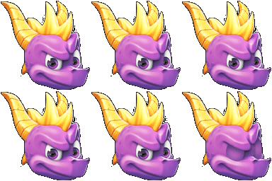
Save Game Icon
